Edit Chart
Setting | Description |
|---|---|
Type | Bar, Bullet, Gauge, Monitor, Multi, Pie or Scatter chart |
Search Type | Datasource or Object Filter settings. Every object or table row results in one data group in the chart. The settings following the search type depend on the chosen type |
Apply filter matrix query | If a filter matrix widget was configured in the dashboard, the chart will show values according to the current settings of the filter matrix |
Search query | Editor for datasource queries |
Order by | Define comma separated order of axis and values if applicable. Example: department desc, salary asc |
Legend | If checked, the legend can be configured to be shown at the top or the bottom of the chart |
Chart height | Height of the chart (without legend) in pixels |
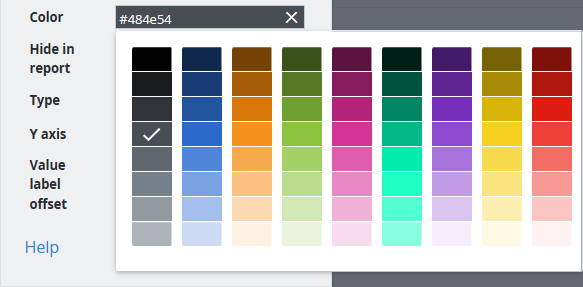
Color palette | Select the color palette for this chart. Qualitative palettes are best used for distinct data categories. Sequential palettes are useful for single variables. Divergent palettes can be used for values that transition from one extreme to another. |
Synchronize colors | If selected, all widgets on the dashboard use the same color for the same value if applicable |
Donut | Show Pie chart in the form of a donut |
Label type | Show key, value or percent as chart labels or do not show labels |
Labels outside | Place labels outside of Pie chart |
Label threshold | Show only labels for values above the configured threshold. If the label type is a percentage, a threshold of 10% must be configured as 0.1 |
Min / Max | Lowest and highest value to display with Bullet or Gauge chart |
Target | Specify target value for Monitor or Bullet chart or leave empty to take target value from SKOOR object configuration |
Warning / Minor /Major | Define thresholds for Gauge or Bullet chart. Allows placeholders. The Gauge chart allows to use "</>" to define upper or lower bounds. If "</>" is omitted, "<" is assumed. It is possible to combine an upper and lower bound using a ",". In the Bullet chart, all thresholds are treated as "<" and only "<" SKOOR object thresholds are displayed. Examples:
|
Show X axis | X axis labels are displayed if checked |
Show controls | Switch on or off controls to select or deselect values in the chart |
Show values | Values are or are not shown in the graph |
Stacked | Stack values inside one group |
Separate stack colors | If selected, the order of colors is the same in all stacks of the chart but a color can not be associated with a certain value. Synchronize colors and Legend can not be selected together with this setting |
Rotate labels | Angle to rotate the labels so they do not overlap |
Precision | Specify the decimal places used for values |
Orientation | Display bars horizontal or vertical |
Y Axis configuration | Precision of values, min and max value as well as the label shown on the left and right Y axis |
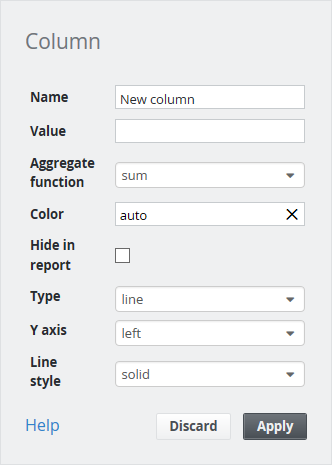
X Axis Label | Label to display on the X Axis. Can be either a SKOOR object name, a SKOOR object property or a data source column |
Pivot | Datasource column, custom property or object name to use for pivot function or none if not used |
Expand Interval | Bar- or Multi-Charts can expand their X axis in case of date values to the interval begin and end values set by a date picker |
SKOOR object value or data source column
Color picker: