 Documentazione
Tabella
Le tabelle sono costituite da colonne configurabili e possono riportare i valori degli oggetti SKOOR o i dati provenienti da una fonte esterna
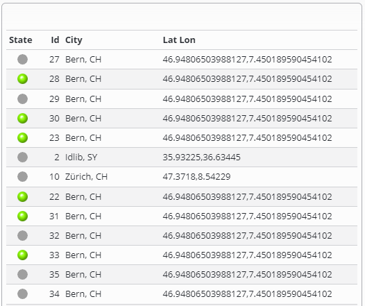
Ogni riga di una tabella corrisponde a un singolo oggetto SKOOR o a una riga nella fonte di dati esterna e può elencarne i vari valori.
Filtri
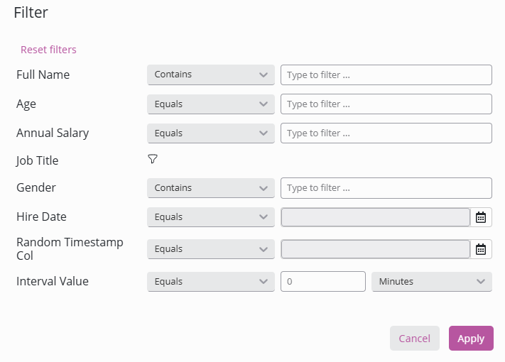
Per ogni colonna è possibile impostare un filtro nella finestra di dialogo dei filtri o nell'intestazione della colonna, se configurata nel widget. Può essere utilizzato per filtrare le righe della tabella in modo che corrispondano a una stringa di testo specifica o per mostrare solo le righe che corrispondono a un valore o a un testo attualmente esistente nell'elenco utilizzando un menu a tendina. La finestra di dialogo dei filtri offre un'interfaccia intuitiva per creare facilmente filtri complessi. Nella sezione "filtri in linea" è possibile imparare a configurare i filtri in linea legacy visualizzati nell'intestazione.
All'interno della finestra di dialogo del filtro: selezionare facilmente operatori come "contiene", "è uguale a", "è maggiore di", ecc. e inserire valori senza dover memorizzare la sintassi:
Filtri di intervallo: specificamente per le colonne numeriche e di data, è possibile definire facilmente intervalli (Da..A)
Selettori di data e ora: i selettori integrati per le colonne di data e timestamp rendono la selezione degli intervalli di tempo semplicissima
Selezione multipla: seleziona più valori da un elenco per le query "IN"
Caratteri jolly
Tutti i filtri di testo supportano il carattere jolly *. Ciò consente di cercare parti di una stringa.
Dev*Dev*ment*ment100*2022*
Colonne contenenti numeri o date
IN(x,y,z)
Specificare un singolo valore o più valori. I risultati includono solo i record in cui i dati nella colonna corrispondono al valore nel filtro.NOT(IN(x,y,z))
Inversione di "in"BETWEEN(x,y)
Specificare due valori. Il risultato include solo i record in cui i dati nella colonna sono compresi tra i due valori specificati.>
Specificare un singolo valore. I risultati includono solo i record in cui i dati nella colonna sono maggiori del valore nel filtro.<
Specificare un singolo valore. I risultati includono solo i record in cui i dati nella colonna sono inferiori al valore nel filtro.>=
Specificare un singolo valore o più valori. I risultati includono solo i record in cui i dati nella colonna sono maggiori o uguali al valore nel filtro.<=
Specificare un singolo valore o più valori. I risultati includono solo i record in cui i dati nella colonna sono inferiori o uguali al valore nel filtro.
Colonne contenenti testo
AND(x,y,z)
Specificare due o più stringhe o caratteri. I risultati includono solo i record con tutte le stringhe specificate.OR(x,y,z)
Specificare due o più stringhe o caratteri. I risultati includono solo i record con almeno una delle stringhe specificate.NOT(x)
Specificare un carattere o una stringa. I risultati includono solo i record in cui non compare la stringa specificata.
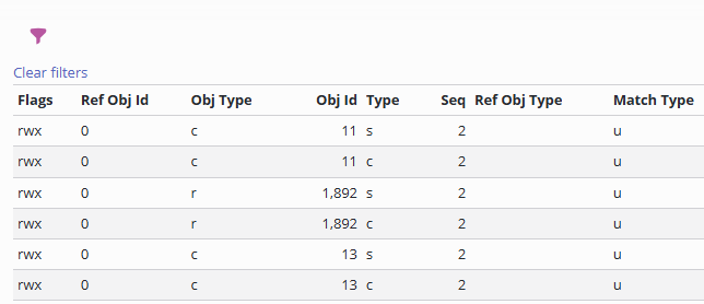
I filtri di testo possono anche essere nidificati.
Reimposta filtri
Tutti i filtri possono essere reimpostati (ripristino delle impostazioni predefinite) o cancellati tramite il rispettivo link sopra la tabella o nella finestra di dialogo dei filtri:
Filtri in linea e valori predefiniti
I filtri possono essere visualizzati in linea nell'intestazione della colonna se l'opzione "Mostra nell'intestazione" è selezionata nella configurazione della colonna, che mostra anche i campi di configurazione legacy "corrispondenza testo" e "filtro predefinito".
Per i filtri visualizzati nella finestra di dialogo dei filtri, è presente un campo filtro predefinito più intuitivo.
Intestazioni e colonne fisse
È possibile configurare un numero fisso di intestazioni e colonne nelle impostazioni della tabella:
Aggregazione e subaggregazione
Le righe con valori numerici possono essere aggregate (somma, media, minimo, massimo). Inoltre, i valori possono essere raggruppati in base ai valori delle colonne e aggregati nuovamente:
Tipi di colonna
Per ulteriori dettagli sulla modifica delle colonne, consultare la sezione sottostante Dettagli colonna
È possibile configurare i seguenti tipi di colonna:
Impostazione | Descrizione |
|---|---|
Nome | Mostra il nome di un oggetto SKOOR |
Tipo | Mostra il tipo di un oggetto SKOOR |
Sottotipo | Mostra il sottotipo di un oggetto SKOOR |
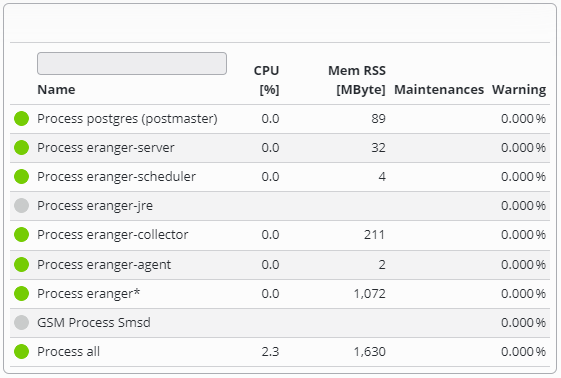
Stato | Mostra lo stato di un oggetto SKOOR. Lo stato può essere visualizzato sia come lampadina che come semplice testo. Cliccando sullo stato si apre la cronologia dello stato dell'oggetto |
Statistiche di stato | Mostra la percentuale di uno stato specifico in un intervallo di tempo specifico per un oggetto SKOOR (lo stato e l'intervallo di tempo sono personalizzabili) |
Proprietà | Mostra una proprietà specifica di un oggetto SKOOR |
Conteggio | Conta il numero di oggetti SKOOR in base a un filtro o a un'operazione di ricerca |
Valore | Mostra un valore di un oggetto SKOOR |
Nome dispositivo | Se la riga contiene un oggetto di tipo job, viene visualizzato il nome del dispositivo correlato |
Genitore | Mostra l'oggetto padre dell'oggetto corrente |
Motivi | Motivo degli stati diversi da OK |
Messaggio | Messaggi generati dai lavori |
Seleziona | Mostra un flag per la selezione |
Manutenzione | Mostra le manutenzioni pianificate e in corso di un oggetto SKOOR |
Origine dati | Mostra il valore di una colonna di una riga della fonte dati |
Dataquery | Mostra il valore di una colonna di una query di dati |
Espressione | Mostra un'espressione specifica nella riga della tabella |
Annotazione | Aggiunge annotazioni alla riga della tabella |
Modifica del widget Tabella:
Nozioni di base
La configurazione della tabella è suddivisa in due parti.
Nella prima parte vengono configurate le impostazioni generali della tabella, come l'intestazione, il numero di righe per pagina o le funzioni di aggregazione
La seconda parte, la sezione Origine dati, riguarda i dati effettivi nella tabella, generati principalmente da oggetti SKOOR o memorizzati in un database. In questa sezione, i dati possono essere caricati, filtrati, arricchiti con overlay e così via
Gli oggetti SKOOR possono essere caricati utilizzando un filtro oggetti. Ogni oggetto generato dal filtro produce una riga nella tabella
I database possono essere interrogati utilizzando il tipo di ricerca Origine dati (tabelle o viste) o Interrogazione dati (SQL)
Impostazioni tabella
Impostazione | Descrizione |
|---|---|
Dimensione pagina | Numero di righe visibili per pagina. Se le righe sono più numerose, viene visualizzato un selettore di pagina  La dimensione della pagina viene ignorata se una o più colonne hanno la modalità pivot impostata. |
Mostra tutte le pagine nel report | Se deselezionata, nei report sarà visibile solo la prima pagina di una tabella impaginata |
Mostra righe vuote | Mostra le righe vuote se il numero di righe è inferiore alla dimensione della pagina. 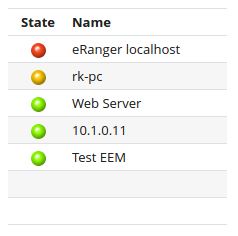 |
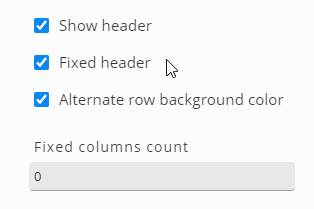
Mostra intestazione | Mostra o nascondi l'intestazione della tabella. Si prega di notare che i filtri di colonna predefiniti vengono sempre utilizzati, anche se una colonna o l'intera intestazione è nascosta |
Intestazione fissa | L'intestazione rimane visibile quando le righe vengono fatte scorrere verticalmente. Questo di solito richiede un'altezza del widget configurata per abilitare lo scorrimento al suo interno. |
Colore di sfondo delle righe alternato | Le righe adiacenti vengono visualizzate con colori leggermente diversi per aumentare la leggibilità |
Numero di colonne fisse | Numero di colonne a partire da sinistra che rimarranno visibili durante lo scorrimento orizzontale |
Riga di aggregazione | Aggiunge una riga con i valori aggregati alla tabella.
 |
Posizione della riga di aggregazione | Visualizza i valori aggregati nella parte superiore o inferiore della tabella |
Numero di colonne di sottoaggregati | Aggiunge una riga di aggregazione basata su una o più colonne
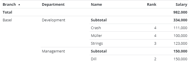 |
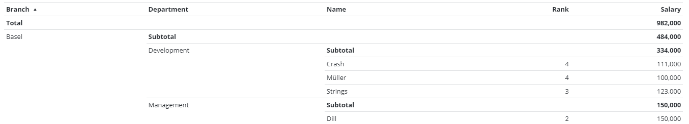
Mostra sottoaggregati nidificati | Aggiunge un subtotale su un gruppo di valori aggregati. L'esempio seguente mostra il totale di tutte le filiali più il subtotale per filiale e reparto 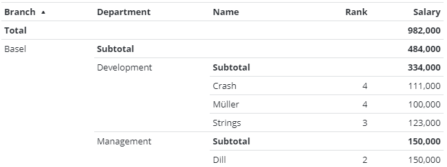 |
Mantieni filtri | Se l'opzione Mantieni filtri è attiva, i filtri dinamici delle colonne non vengono cancellati al cambio di pagina |
Consenti esportazione | I dati possono essere esportati nei formati CSV o XLSX |
Azione al clic | Specificare un'azione da eseguire quando si fa clic su una voce nella tabella. Sono disponibili i seguenti segnaposto:
|
Fornisci parametro filtro tabella | Fornisce il filtro attualmente applicato come parametro URL, inclusi i filtri di intestazione, la matrice di filtro e la query di ricerca. Questo può essere utilizzato per passare questo filtro ad altri widget che devono visualizzare informazioni basate sugli elementi attualmente visualizzati. |
Nome del parametro del filtro della tabella | Nome del parametro URL per il filtro della tabella. Il valore predefinito è |
Pivot | Consente di distribuire le colonne in verticale, in orizzontale o in entrambi i modi in base ai valori. |
Origine dati
Impostazione | Descrizione |
|---|---|
Tipo di ricerca | Selezionare l'origine dati richiesta. I campi della parte relativa all'origine dati della configurazione cambiano in base al tipo di ricerca |
Oggetto, Oggetti sottostanti | Selezionare uno o più oggetti SKOOR utilizzando i filtri comuni degli oggetti |
Origine dati | Seleziona un database. I database sono configurati nella sezione Dati e oggetti |
Tabella | Seleziona una delle tabelle o delle viste di un database |
Interrogazione dati | Selezionare una query di dati. Le query di dati sono configurate nella sezione Dati e oggetti |
Applica query matrice di filtri | Se nel dashboard è configurato un widget Matrice di filtri, i filtri di quel widget vengono applicati se le colonne di entrambi i widget corrispondono |
Query di ricerca | Definire i filtri come descritto nell'editor delle query delle origini dati |
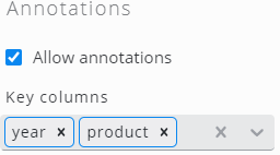
Annotazioni
Selezionare Consenti annotazioni per abilitare la funzione di annotazione. Assicurarsi che una o più colonne siano definite come chiave in questa sezione, che viene utilizzata per mappare ciascuna annotazione a una riga di dati:
Colonne
Fare clic su Sincronizza colonne per aggiungere tutte le colonne disponibili dalla tabella configurata o dalla query di dati. Se viene utilizzato solo un sottoinsieme delle colonne disponibili, fare clic su Aggiungi colonna per aggiungere colonne o eliminare quelle inutilizzate dopo averle sincronizzate tutte. Per modificare l'ordine delle colonne, è sufficiente trascinare e rilasciare le voci delle colonne.
Aprire le impostazioni facendo clic su una voce della colonna:
Impostazione | Descrizione |
|---|---|
Il tipo di colonna dipende dal Tipo di ricerca definito nella sezione Origine dati del widget | |
Nome | Nome della colonna. Viene visualizzato nell'intestazione della tabella |
Titolo | Campo espressione da utilizzare come intestazione della colonna; se vuoto, verrà utilizzato il valore in Nome. |
Attiva al doppio clic | L'azione definita nella sezione ClickAction viene attivata solo con un doppio clic |
Larghezza | Larghezza esatta in pixel o % (opzionale) |
Larghezza minima | Larghezza minima della colonna in pixel o % (opzionale) |
Allinea | Allinea il testo a sinistra, al centro o a destra |
Altezza dell'intestazione | Altezza dell'intestazione in pixel |
Tipo di filtro | Tipo di filtro dinamico
|
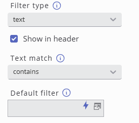
Mostra nell'intestazione | Disponibile solo se il tipo di filtro è impostato su " Se selezionato, mostra la corrispondenza di testo legacy e il filtro predefinito. Se deselezionato, appare un campo combinato operatore/valore predefinito. |
Corrispondenza testo | Disponibile solo se il tipo di filtro è impostato su " Definisce il comportamento del filtro della tabella.
Il carattere jolly |
Filtro predefinito | Il testo del filtro dinamico può essere preimpostato. Si prega di notare che il filtro è attivo anche se la colonna non è visualizzata |
Priorità di ordinamento | Imposta una priorità di ordinamento per rendere la colonna ordinabile. Le righe vengono ordinate in base alla priorità di ordinamento. Se due colonne hanno la stessa priorità di ordinamento, la priorità è determinata dalla precedenza della colonna |
Direzione di ordinamento predefinita | Ordina in modo ascendente o discendente per impostazione predefinita |
Mostra | Se mostrare la colonna (impostazione predefinita) o meno. Si noti che i filtri predefiniti sono attivi anche per le colonne nascoste |
Nascondi se vuota | Nascondi la colonna se nessuna riga della tabella contiene un valore per questa colonna |
Nascondi su schermi di piccole dimensioni | Nascondi la colonna se non rientra nello schermo |
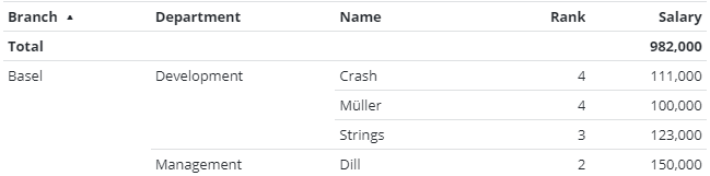
Nascondi ripetizioni | Nascondi i valori ripetitivi. Questo può essere utilizzato per ottenere una sorta di raggruppamento: 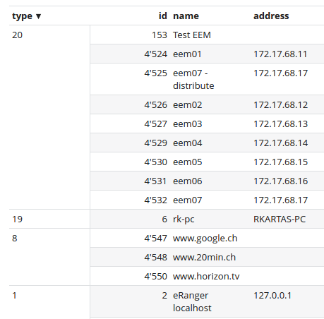 |
Unisci le righe duplicate | Mostra solo una delle righe con lo stesso valore in questa colonna |
Mostra valore aggregato | Attiva o disattiva questo valore nelle righe di aggregazione in alto o in basso nella tabella |
Direzione dell'intestazione | Intestazione orizzontale o verticale. Se si sceglie quella verticale, è necessario impostare l’altezza dell’intestazione su un valore appropriato (per motivi tecnici, la dimensione dell’intestazione non può essere determinata automaticamente) |
Visualizza come HTML | Interpreta i tag HTML in questa colonna |
Classe condizionale | Specificamente per le colonne Conteggio. |
Oggetto personalizzato | Imposta per utilizzare un oggetto SKOOR personalizzato |
Impostazioni dei tipi di colonna
Nome
Visualizza il nome dell'oggetto riga. Nessuna impostazione disponibile.
Tipo
Visualizza il tipo dell'oggetto riga. Nessuna impostazione disponibile.
Sottotipo
Visualizza il sottotipo dell'oggetto riga. Nessuna impostazione disponibile.
Stato
Visualizza lo stato dell'oggetto riga sotto forma di lampadina o testo.
Impostazione | Descrizione |
|---|---|
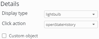
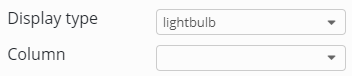
Tipo di visualizzazione | Seleziona come visualizzare lo stato di un oggetto SKOOR:
|
Colonna | La colonna in cui si trova lo stato. |
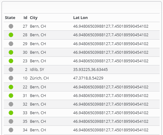
Tutti gli stati nella selezione | Mostra tutti gli stati nel filtro. 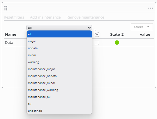 |


Quando il tipo di ricerca restituisce oggetti SKOOR, è possibile definire l'azione del clic per la colonna. Attivando Oggetto personalizzato è possibile mostrare lo stato di un oggetto SKOOR arbitrario (selezionato dal filtro oggetti).
Quando il tipo di ricerca è "origine dati" o "query dati", selezionare la colonna che contiene gli stati richiesti dal menu a tendina Colonna:
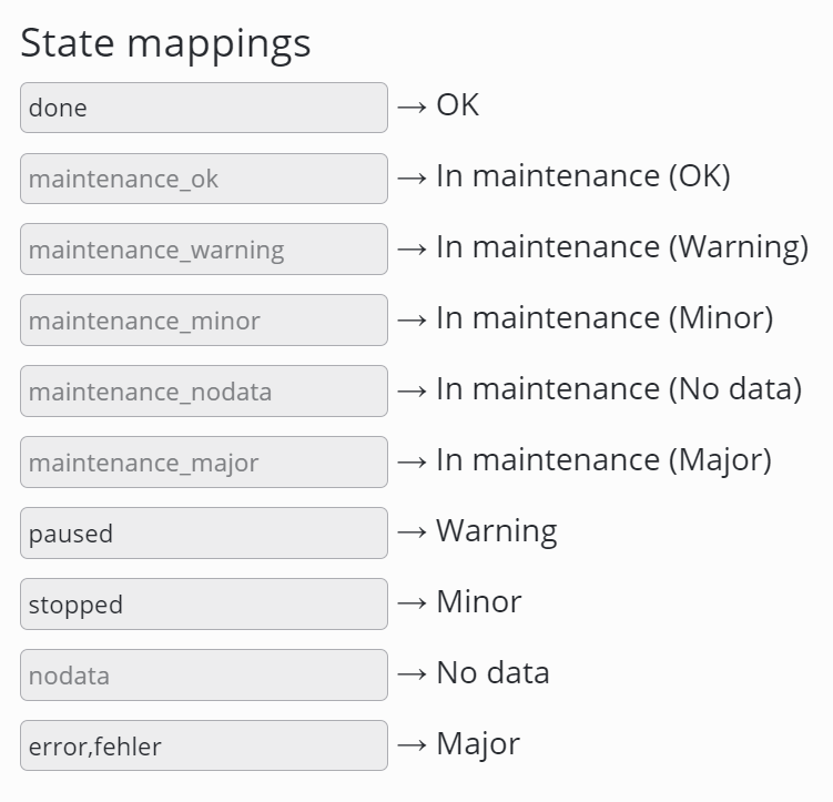
Se la colonna dello stato viene utilizzata su una tabella basata su una fonte dati o una query dati, i valori possono essere mappati agli stati (SKOOR Dashboard >= 7.1.2).
Per mappare più valori a un unico stato, i valori possono essere definiti come un elenco separato da virgole.
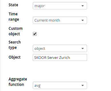
Statistiche di stato
Calcola la percentuale dell'oggetto che si trova nello stato selezionato. Se nella colonna è configurato un oggetto personalizzato, è possibile selezionare più di un oggetto tramite il filtro di ricerca. In questo caso, tutti gli oggetti vengono aggregati dalla funzione di aggregazione selezionata.
Impostazione | Descrizione |
|---|---|
Stato | Seleziona lo stato di cui desideri ottenere le statistiche |
Manutenzione OK | Imposta se la manutenzione deve essere considerata come Ok |
Funzione di aggregazione | Seleziona una funzione di aggregazione da utilizzare nel calcolo delle statistiche dello stato. |
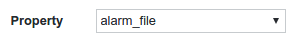
Proprietà
Visualizza una proprietà dell'oggetto riga.
Conta
Conta gli oggetti in base a un filtro oggetti
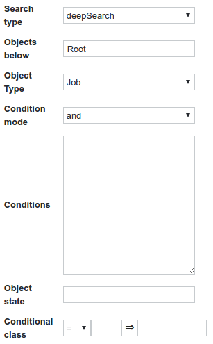
Il campo Condizioni accetta i soliti segnaposto.
Per ottenere un riferimento all'oggetto riga è possibile utilizzare il seguente frammento di codice:
{
  "item": "id",
  "operator": "eq",
  "expression": %id%
}
È anche possibile impostare una classe personalizzata per un determinato conteggio. Ciò è particolarmente utile per colorare i conteggi superiori a un valore specificato:
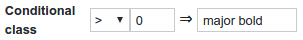
Classi utili:
grassetto
Major
Minor
Warning
OK
Valore
Visualizza un valore dell'oggetto riga. Attivando l'opzione Oggetto personalizzato è possibile mostrare il valore di un oggetto SKOOR arbitrario (selezionato tramite il filtro oggetti).
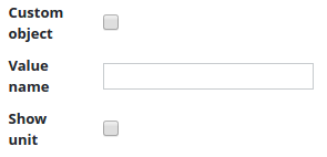
Il valore può essere definito tramite la sua chiave di valore. I valori di ritorno e i valori stringa accettano l'indice in notazione array (ad es. returnValue[0]) o il nome dell'unità definita.
Impostazione | Descrizione |
|---|---|
Nome del valore | Specificare il nome del valore di un oggetto SKOOR. |
Mostra unità | Imposta se mostrare o meno l'unità di misura di quel valore. |
Funzione di aggregazione | Selezionare una funzione di aggregazione da applicare al valore. |
Nome dispositivo
Visualizza il nome del dispositivo correlato se l'oggetto è un lavoro.
Genitore
Visualizza l'oggetto padre dell'oggetto corrente.
Motivi
Il motivo per cui gli oggetti si trovano in uno stato come "Major", "Minor" o "Warning".
Messaggio
Visualizza il messaggio informativo sul lavoro, se disponibile.
Seleziona
Aggiunge opzioni per aggiungere o rimuovere la manutenzione, oltre a una casella di controllo per ogni riga.
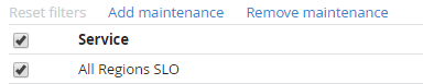
Manutenzione
Visualizza le manutenzioni attuali.
Origine dati
Visualizza il valore di una colonna della tabella dell'origine dati.
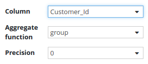
È possibile impostare la funzione di aggregazione per aggregare i valori della colonna.
Se la colonna è di tipo float, è possibile impostare la precisione del valore.
Impostazione | Descrizione |
|---|---|
Colonna | Selezionare la colonna desiderata dell'origine dati. |
Unità di origine | L'unità dei dati nella colonna. |
Unità di destinazione | L'unità di destinazione in cui convertire i valori. |
Mostra unità | Mostra l'unità nell'intestazione della tabella. |
Funzione di aggregazione | Seleziona una funzione di aggregazione da applicare al valore della colonna. |
Precisione | Imposta la precisione del valore (per i valori in virgola mobile). |
Formato ora | Definire un formato ora preferito. |
Modalità pivot | Per visualizzare questa impostazione, la funzione di aggregazione deve essere impostata su "raggruppa". Genera dinamicamente le colonne in base ai valori di questa colonna. Opzioni:
|
Query dati
Visualizza un valore di colonna di una query dati. Le stesse opzioni di configurazione delle origini dati si applicano anche alle colonne delle query dati.
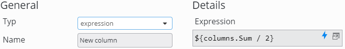
Espressione
Le colonne di espressione possono calcolare valori da altre colonne configurate in questo widget tabella. È possibile fare riferimento ad altre colonne in due modi:
${columns.<nome colonna>}
${columns[“<nome colonna”]}
Come <nome colonna>, impostare esattamente il nome configurato nella rispettiva colonna (ad es. con la maiuscola all'inizio)
Per ulteriori dettagli, consultare anche la pagina Segnaposto.
Annotazione
Con questo tipo di colonna, gli utenti possono arricchire i dati di una fonte o di una query con delle annotazioni. Esistono cinque tipi di colonne di annotazione:
Impostazione | Descrizione |
|---|---|
Tipo di visualizzazione | Un elenco a discesa con il tipo desiderato di annotazione:
|
Pulsante | Aggiunge un pulsante a ogni riga della tabella per inserire annotazioni. Inoltre, qui è possibile configurare un insieme fisso di stati con le possibili transizioni tra di essi. Fare clic sul pulsante Aggiungi per aggiungere stati: 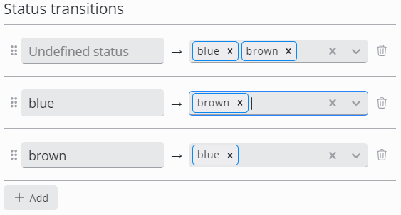 È necessario configurare una transizione dallo stato Undefined. In caso contrario, non sarà possibile aggiungere alcuna annotazione |
Stato | Visualizza lo stato attuale delle annotazioni di ogni riga |
Descrizione | Visualizza la descrizione corrente dell'annotazione |
Creata | Visualizza la data di creazione dell'annotazione |
Utente | Visualizza l'utente che ha creato l'annotazione |
Per ulteriori dettagli, visita la pagina Annotazioni.
Impostazioni avanzate delle colonne
Azioni al clic
A seconda del tipo di colonna, è possibile definire azioni di clic per il drill-down o per navigare in un punto specifico al clic. Vedere Azione di clic per i dettagli.
Stile delle celle
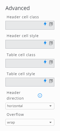
È possibile personalizzare lo stile di ogni cella della tabella utilizzando i CSS. Ciò può essere fatto utilizzando CSS inline (Stile cella intestazione, Stile cella tabella) o classi CSS che possono essere definite nelle impostazioni Stile di un dashboard.
Impostazione | Descrizione |
|---|---|
Classe cella di intestazione | Fornire un nome di classe per l'intestazione (utilizzabile nello stile CSS) |
Stile cella di intestazione | Definire lo stile specifico dell'intestazione (in CSS) |
Classe della cella della tabella | Fornire un nome di classe per l'intera tabella (utilizzabile nello styling CSS) |
Stile delle celle della tabella | Definisci uno stile specifico per l'intera tabella (in CSS) |
Direzione dell'intestazione | Intestazione orizzontale o verticale. Se si sceglie quella verticale, è necessario impostare l’altezza dell’intestazione su un valore appropriato (per motivi tecnici, la dimensione dell’intestazione non può essere determinata automaticamente) |
overflow | Seleziona la gestione predefinita degli overflow:
|
Stile delle tabelle
Icona dipendente dal contenuto
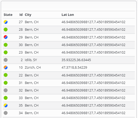
A partire da SKOOR Dashboard 7.1.2 è possibile utilizzare la colonna "state" (Stato) nelle tabelle basate su origini dati e query di dati. I valori possono essere mappati agli stati e vengono visualizzate le corrispondenti icone a forma di lampadina. Per ulteriori dettagli, consultare https://skoorag.atlassian.net/wiki/spaces/DOC/pages/494473/Table#State.
Utilizzando la funzionalità introdotta con SKOOR Dashboard 7.1.2, lo stesso esempio riportato di seguito apparirebbe così:
Problema
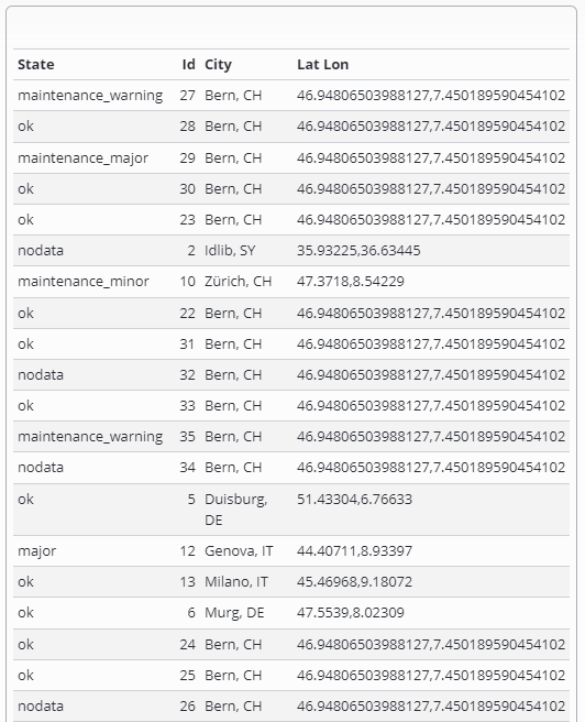
Il contenuto della cella della tabella (ad es. OK) dovrebbe essere sostituito con un'icona (ad es. una lampadina).
Soluzione
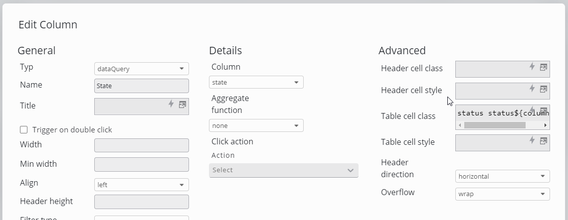
Impostare la classe della cella della tabella nelle impostazioni della colonna
 |
|
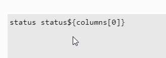
Nell'esempio sopra riportato, il valore della classe viene preso dalla terza colonna di ogni riga. Nell'esempio, il risultato sarà una classe impostata su status statusOK.
Aggiungere del codice CSS nella finestra di dialogo delle impostazioni del dashboard
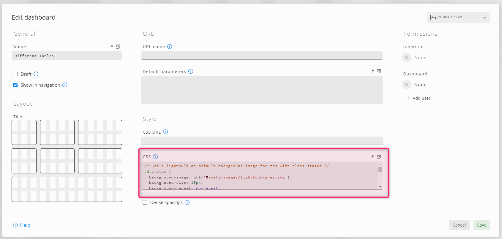
/* Set a lightbulb as default background image for tds with class status */
td.status {
  background-image: url('assets/images/lightbulb-grey.svg');
  background-size: 15px;
  background-repeat: no-repeat;
  background-position: center 6px;
}

/*
 * Absolute positioned elements (the tooltip in this case) always take the
 * next not static positioned element as the anchor point
 */
td.status > div {
  position: relative;
  overflow: visible;
}

/*
 * Makes the inner td absolute positioned and style the span that it looks like a tooltip.
 * Initially, the tooltip is hidden.
 */
td.status > div > span {
    padding: 2px;
    display:none;
    position: absolute;
    top: -3px;
    left: 30px;
    text-align: left;
    background-color: #eff0f1;
    border: 1px solid #c7cbce;
    -moz-border-radius: 2px;
    -webkit-border-radius: 2px;
    -ms-border-radius: 2px;
    border-radius: 2px;
    white-space: nowrap;
}

/* Shows the tooltip on hover */
td.status:hover > div > span {
  display: block;
}

/*
 * Defines the background image for the defined value.
 * You need one of those for each possible content, undefined values
 * will display the default image.
 */
td.statusOK {
  background-image: url('assets/images/lightbulb-green.svg');
}
Ciò darà come risultato una bella icona che mostra il testo originale al passaggio del mouse.
Si noti che, poiché abbiamo gestito solo la classe statusok, tutte le altre classi avranno l'icona standard della lampadina grigia
Invece di utilizzare un URL di file per le immagini, è anche possibile incorporare le immagini direttamente nel CSS utilizzando URL di dati:
td.statusOK {
  background-image: url('data:image/png;base64,iVBORw0KGgoAAAANSUhEUgAAAEAAAABACAYAAACqaXHeAAAAAklEQVR4AewaftIAABVDSURBVI3BW+zue14X9tf7+zxrn2bPntkzQxk5OYhFEDwMSBMkaYgXtrUxISlclBIgKl4ZjzGWxGjjKRqjCdEbSQDbK9MQU29KvGhpAo2Wxg6ESYqiwHAxzDCz2Xv22muvtf7P7/t597+e/z7MmgHp65W2Dg+96t951f/rs37eZ/ysz/o5b85ntNWhQ0vHVYeWlg5Ki9KitLS+VH1r229SX4+PtD6sXm493woe4rXWp9UnWr+gPvYH3/sn/vW3vPcHftVvJ75YiLfEnRBvCb/j9Iec3XrkFZ/xMZ/xs37dv/FKP+7SBzp0aOnQ0qJ0aGlRWpRW1De3vqv1x/ANiCeC+s28gBfwZfiot3zs9R/txz73o7/U+gn8eOunMD5P3ApC3ApZJAhZrJBFTrEWWaxT/OX3P3Z2602/7lP+tU/7v73af+uYGx2UGTquOrQoLS1Ki3qp9f34AXyjWwktQkRbQlDEndZvJfga/JnWn1G/jB9p/TA+41a9JcStkCEhiw5drJJWF+sU6urs1ps+5ZN+2mv9D2a2Dh06tLQoLcoM6qr1kvrz+HP4gLcknlIkoQhaipLSuiqCulVf6Ktbf0v9oPrh8vfwaW8pEhoSMmTRomTIQsspnji79cCnvNZ/b2Z06NChpUXp0NKinlit78PfwYfdSmgR70hcpa5adxqKlqIYV0XcCnWr3lVPvKf8BfUn1d8sP4SLJ+KqIcGQhUUWKS1aT5zdOnpj9ujQ0qGlpYPS0qKe+Ejrx/DtvkDiaUERd+oqpUVD0RIyzCDuDELrHS1K66XW38f3qO/Dz9WtuEpIUPawFjkR7zp7otGhQ0tLhxalpUU98Z2tH8FL3hbviFvxtOVOCepWSWlRZiKlaqFDgyAktAjqqnWn/kDrZ9Rfwj/2RCgSMmQxJSUlJ1dnt1pm6Ljq0NKhdacW/nbrryA+T+JdcZW4SlzVu1KUIqXDCh0kpIRsLHdKg5LQulNa1DOtf4RvUX8aj4WGICUlJUVdnd1q6dCidGhpUU/ca/1TfLfPk7gTVwlxK4irxFXcCkrdKiktQkpDhxHUKjMIFgtTWlcJLUqL0vpefAW+Q933RGjJkEVOqKvlLS0tHVpalNa91v+M7/Z5EndCQkKCRRZZZJFFFlkkZLEW60ROrBPrRBY5kRNrkRVZrEUWgpAgiC/Setsfaf3L1kstM3SYzWzmYLar5YnSwTBDhw6thX+qvsPnSdwJCQlZZJFFFglZJGSRxVqsRRZZrEUWWawTa7EWObFO5BRZJGSRkEWCeFq9Y4bWt3b8i47nOszQ0qGb2a6WWy3KDEqLov62+m5P1FW8JSQkCAlZJCRksRY5sRbrRE7kxDqxFlmsxVpkkRM5sU5ksRZZkUVCFoIQJIg7cdWiGFrf3vEjHelmNrOZodvV2RNlBqVFPfGdrb+SeFoQEhKELBJXWSQkCAniN5XSkjKDEgwWBikpqwxSUlrUnaCe0qKU71b/D/6BILSoq7NbRQel9cRH8CNIS4K4ExIShCwSEoQVLBKEhGRZuWc5oabbOLRDUVboUKwwSFknt2JaKQkJCUJCPa111dJ64u+2fgo/k5AwdXX2RFFaVPBjeEk8JXGVIGSRkCCsRRZCwnk973lf4nlf4hnvdfKMqp1HbrzuYV7xyCuOeUgRBJu1XE1JyYq0UlIyNCQk1NNalBZ1Vv9T+YPiUcOqq7NbLR2U8v349gRFPCVxlZCQIKxFFglZJy/my7zP13ivr/K8D7nnRctZjcMjN173yCse+DX31ye80U+aXhTFIMiJlCxSMiRkkaFBSKg7QVG3Sov6PfjBqb8ezHJ19paW1kv4OwktiXfErZCQIO6Etcgii1Oe9XK+1gd9g/f53V70lZ7zAfe8IE7qcPHQxX0PveJNn/IeH/Za/oPX8u/cuO+JlGCVLrJII6tSUrLIkFAktN7R0qK0qL+MHyu/oq7OnigdT/x5fLhIPC0k7oSEhCwEi1Oe86F8oy/xUR/0Dd7na7zHl3nW+508J9guDm+6cd8jv+EFX+I5H/CM97nnPV5ZP++RV626mrIWPZGSRYaEBCFBvKOe1tKh9Tz+Gv5E4ursVlttX8KfS0IpEnfiXUFcZZGQxSn3fCBf5z/xzb7ER33A7/WSr/acl53cQ9yp7XB44Fnv94z3OnuPs+cs90T8+vpZj/s5KQk5sUoXWZFVBossOiQ0vlhRWpTW9+Bv4FfcOntbfT8+UJXE2+ItISEhIYuEhCTem6/0Ib/fh/x+H/T7vOxrPeslxNPi5J6T91mesZzFElE1DoeHPrN+1tEbKSkJCQkJWWRISBBXiXeVlhalpeMe/iz+olvLE5XWD3iitPWOuIpbQVwlCMKz671e9nVe9nXe72u93+/2rPchfmtx9rxnvORZL3vOB73gw170FV7yu7yYL2eRIGSRRRYWCQkJQkLiTjylpaXjqvW9rWfdWq7yzeobO75I3QriKiEhISErXvRV3ud3eZ+v9pLf6Vnv9/9HEMvJPWfPu+dFz3nZC77Ui77SOc+ySBASEpJIEAQhQVzFb6KuOtXpB2f6x91abv3a4499V+uqRVHviDuJO0EQ7nnBi77ci77cCz7seR8S8durwyMXbzo8Mi6o5Z57XvCcl93zHgkJCVkICUJCQoK4E08rSktLS4eO73Lr7Na/f/S//rHWVdyKL5J4R+JOeCbv9ZwPetbLnvE+J8/6j6naHrt4w437btx38bob99247/BQjTg55RlPJO6EhISEBCFxlRC34in1llZLi/qjj48H5/NnL//uS+8fv/YNCa07JWhZPk9IXCUEZ+9xzwtOnrWc/FZqu3jgkdfceM2N+27cd3jg4k2HBy4euPG6R151eFNtb0uIW0EQV4k78UXqLXXV0qGD9v2/+Mr/+dHzJx799LeqFIl3tARF/BbCchJLje1iu7Hc8666eNNDn/XQZzz2qsc+58Z9hzccHjo8sj12eOjwpsc+58brDo8l1FtC4ipC6omEuBVX8ZbSorR0UJSWf/vZn/628ycf/+w3dUjocpW6VYT6YvGOGuMwbhzedPGGk2ctZ1UX9z3wKW/6tEde8cirbnzOxQOHN22PbDfGje3G4aGLN1y8qQ6KeEriKm7Fnfgt1a1W0TKD8olXf/abzq/c/OLXt65ShJaUlqAogpbUnXLkkYs3Xbzh4r7HPifOTp41bjz0igd+zUO/7pFXPPaaG284vOnw0LgxLsbFdrHduHjT9sh0q1v1RRLEb6puFaVFaTF0UFo+9fovfv35tcsnPqLUraIELSmKoijiqnV18YYbn/PYax551T3vRZw8Y3vsoc966DMe+qzHfsNj9x3ecHhoe2xcjMPYxmE8tj1yeKS230rdKupOvau07pSipaWlpcMrb3ziI+f7l09+uCVuFaUhpa02UpSWoCVulUsfeJRXPPSK573inhdQJ8/YHnvkFY/8hsde9djrLu67eNP2yLgYh9rGNi7Gje2R7ZHanijqVmlpUepOUbdKUXdaWpQWpaWDsnvzwfPNfvCyuDMISkuK0tKS0pKiKOPigU950ac99EFnz6k6eca4eOQ3PPaaG6+7uO/igcND42Ic6jBGHcbF4bHDI4dHqhRFqXdVKXWrKC2K0tKiaCktBmXGEzm3nlcsd0pKS8uUU2lpSWlpUQwPT5/xhk961vstz6px9rzt4rFX3ficG2+4eODw0HZjXGyPjRtxUtt2Y3vk8NDhIaX1rqIo6k5paWlp6dCitEzp0KGlRV2dVdzqYJGhQemQVFektLQEHRKUow/dz696xkuWZ9V2z3vUuPG6G/ddvOHw0PbYuBiH7bFxY7lnXGw3Dg9dPDC9UXdaWpSWlpYOLS2K0tLSoUOLoaVF6dC6Orce4oWgQ4MhoaWlQ4PQ0GDRQTC8uX7dvfyK5Z7anvGSWC4euPG6wwPbY9uNOowtIs7GxXbj8KbDmw4PVCmKumppaTG0dOgwQ4cOHTq0tNWhQ0uH1lXL+eTZ13Yfv9CSRcdVg9ChqUms0NAgtBgS2u1+ftVyVttzPuDkGdtjN96wPTZujENtY6utDtvF9sjFm268bvdCUVpaWlqUTrW0dOjQoaVDhw4dOrS0GFpXHYrzi6cv//SrN7/0ZQnGOxqEQYJUEw0TVmhQOq62xz63ftk4XDxwz3vU2B4ZF+NQW40addgO22OHhy7uOzzyREuLohg6dOgwQ4cOHTrMMEOHDp3q0MEwQ0uH1q3Tq+f3nX/nJ159/EsfrbcMwgwrriYsjFthhYbG1WC5sz3y+vplF2941vstJ2OrwaCqahuH7WJ76OJN08NVUVqmtMzQYaY6dJjNbGbToZtuZtNhhg4zdFBaWpQPvuerPnH+0DP/6S/88hs/SREsjKvBQsNgpbqjGHeWO4Plzjg8yKc8ym84eUYES8QTVTXGxbiorS1FaWnpYOjQoUM3M3TopptuZjOb2XSYqQ6z6TBDS4vS8uH3fu0vnD/83Dd+rENC605RV+POwniiiIVxZ7kzJUjJqp3Hdh77bdVVi9LSocOUGbqZXbPpZg5mM5sZZjObbmbTzWw6dNOhxdDS8pUvf+PHzl/94h/+16qtCIaGYLlVxp14S6tlNZSWdSKLYAWlIXEnBEVQn6e0KC0tHTrMwRzsXXMwm32wD+ZgNnMwB3Mwm9k1m2666dDSoaV19Xu+9A//q/PveP73/erzp5d/6c3j1a9RBHE1JViYssqcaFlFq41VOqwTWXSRISFBXCWu6k7dqqsWpaWlw2zmYB/MhX0wB3MwB/tgH+yDOZjN7OpmNrOZoUXp0KKeePB7P/yf/8yK5Wtf+q9/wltaOnTToZvZzGYfzEE3s9kHc9Q+mIN9MAdzMJvZ7M1sZrMP9mZv9sEczGY2s5nNbOZgX5gL+1JzqX0wB/vCvrAP5mAuzMEczK7ZzKabDh06dGhRV5GffM+zLz9ebn3lC3/ox1tmaGlpmc1sZjObbuZgH8zBbPbBXGofNRf2hX2wL+yDOZiD2cxmNrOZYTazmYM52Af7wr4wF/al9oV9sC/sG/aFfTAH+2AO5mB2zcEczGY2s2npMIPS0lJ+3K2zW3H6qdYvq69uXTUkGBRll1VSulgli55YpamcWBNZJGQhrhJPqVtFaVE6zFQ3M+yDOdgX5sI+mIN9MBf2wRzsg9nMZjYztHRoUVpvewP/3K2zO6N+pPW3vK0IDQkpGWaRRRYta5GhJ9YipaksskhCSBDvCFpXLVodOszQYTb7YC7sgznYB3OwL8zBHOxds5mDbrrp0KFDhxZ1J/4Z7rt19pbWD6sfxHtad4LQkJCQkpKS0sVaZOgiiyyySEgqQUh8kRalpaVDh9nMwT6YgznYB3OwD+ZgjtqbOZiDbmbToUOHDi3qbYMfSlydvesz6ofLX1BXrTtBaMgiJUMWWTTkRBYJa5GFRUKCELfiXaVulZYOHWbTzWz2wWzmYF+YgzmYXftgNnPQzWw6zNChQ4v6fP8CH/eWs89T/p76k62XWlcJiiC0JCSkZEjIkEUWXSRkISQkiKuE1lWL0qGlmxlm083ezIU52AezmaNmMwez6WY2M3To0KFFab3tSPy1hCxXZ0/7dOtvtv6+umpd1a2QIDRksEjIkEVCFglZJAgJ4ou0KB06dJhhNrOZgzmYg9nMrjmYzWzmYIYOHTp0aFFa7wj/RHxcSFydfbEfUt/T+gOeqKc0JAgJGRqyyJBFBiEhQUgQTystSkuHGTrMZg5mMwezmV1zMJtuZjOblm5aOnRo3SniiU+KvyokWK6WWwmJt13wfepGaenQoUM3s5nNHOyDOZiDfbAv7Av7YB/sgznYF/aFfWFf2Bf2hX1hX9gX9oV9Yd+wb9gX9oU5ah81B3MwB3Mwmw7dzDCbDi2Kelvxp8RrCQmJq7Pf3M/hL7X+kdK6akkwCEVCQwYhQUhIEBLEFystSocp3XSYTYfZNQezmU03M3ToMEOHDkqL+kL/MPETCQlZZLk6e1tIqHf8Y/Utre9tUZTxeULcCnErJIirBCFxJ55WWloMM3ToMFPdzGY23cymwwwdOnRo6aCuWleJJ/43/KAgZJHFWq7OnghZdEiod/zp1leoP9KitJ5St0K8JQhxKyTuxNPqqqVDi2Fa3XSYzWw6zKZDhw4ztBhalNYX+rj4rsQlYS2yyCInV8sTISELQbztMb6j9a+U1lVLS0tLhxlmmE0PZjMH+2AO5sJcmAtzYV/YF/aFfdQctY/aF/bBvrAP5mAOZjOb2cymQzcdOrS+0C/iv0i8mkUWWazFOrFOrpZbQUJCFgnibffxX7b+D7datDrVqdk1u2bX7Jpds2uOml1z1D5qH7WP2kfto/ZR+1L7UnNhX9gX5sJc2AdzYTaz6WY2M3TooLS0tLTe9vHEtyc+KWSRE1nkxDqxTq7ObiVkkSEhiwwNCeX18F+VH9X+ty0tSutOXdWdeFcR1K26U1palJYOHTq0dOjQ0qFDi9LS+s3874nvFK9aZJHFWqwT68Q6s86uzp4IWWSRkiGLDELCxCP13+HftP6uOrcoLUrrHUXraaVuFaVFaWlpUTq0dOjQ0kFpab2riCea+IeJHxSXLLJYJ9Yii3VinVkn1imeOLuVsE4oLTmRkkWLEJTiH+CnW/+j+j0dWlqUulXUVetdpXXVorSuWjooLR1aOigtrTv1hT6Z+FOJnxCyyGKdWIucWGfWmXVmneN0dnX2xCInMqxFSxZZpKyyi40E/b/w0fLf4y+3nldalBalRalbpW4VpW6VFqWlpcXQorS07tQXOsQ/SfzVxGtCFlmsE2uRE+vM6cy6x+kcpzPrnquzWwnrhKFlFSdaUlrWMEFJaDxUf731Y/hrre9R9zq0tCitqxalRWlRihalRWlRWtQ7WleJwf8i/ofEzydYJKwTWawTa7HOrDPrzOkU68y6x+ns6uxWwjqhtChKTyjKnEhpyYq0ruJXWn8Cf6P1Z1vf2/pgx1WL0tJBqVulRWlRWlp3ilJPeSPxz/BD4uMJCVlkkcU6kcU6sU6sM+sep3OsM6czp3uc7rk6u5WwTiitq5ZVnFB36mo2azGlJaH8Cv4iflD9cXxX64+q93doaVFalBalpXWnrlpve4CfxI8n/rm4n5AgZJHFWuTEWuTEOnM6sc6sc5zOrHuc7nG6xzq7OntisU60LLeK+o8akVbqKnWnHjd+XP04zvgovg3fpL6+9RH1wVbUF3oVn8AvJD72n331f/Ovvu13f9fPiMc+X4hbcZUgJAgJCUIWSWSRkEVClqv/D5eiv5izZ1jqAAAAAElFTkSuQmCC');
}
il risultato sarebbe simile a questo: