Grafico
I grafici possono visualizzare sia i valori degli oggetti SKOOR sia i valori provenienti da una fonte di dati esterna. Sono disponibili vari tipi di grafici.
L'aggiunta di una sovrapposizione dei dati di origine aiuta a individuare la causa alla base di determinati valori in un grafico.
Tipo di grafico | Esempio |
|---|---|
A torta | 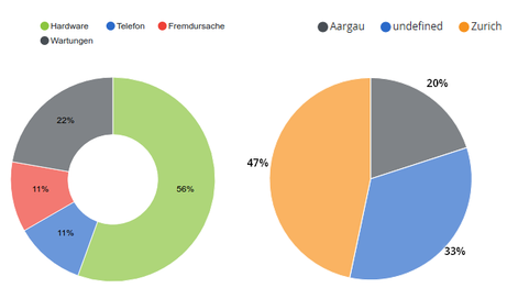 |
MonitorPer ulteriori dettagli, consultare il grafico Monitor |  |
Valore singolo |  |
Barraper ulteriori dettagli, consultare il grafico a barre | 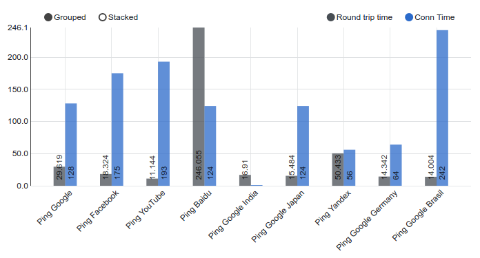 |
Misto | 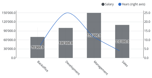 |
Punto |  |
Indicatore | 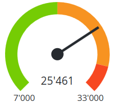 |
A dispersione | 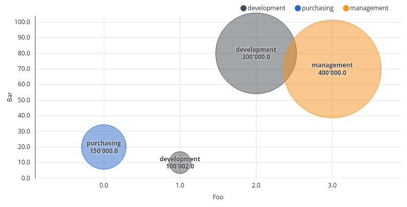 |
Modifica del widget del grafico:
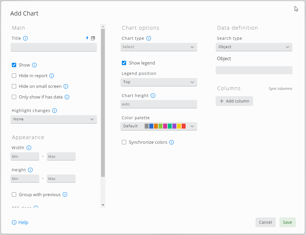
Impostazioni | Descrizione | ||
|---|---|---|---|
Tipo di grafico | Grafico a barre, a pallini, a indicatore, a monitor, misto, singolo, a torta o a dispersione | ||
Tipo di ricerca | Impostazioni per "Origine dati", "Query dati" o "Filtro oggetti". Ogni oggetto o riga della tabella genera un gruppo di dati nel grafico. Le impostazioni relative al tipo di ricerca dipendono dal tipo scelto | ||
Applica query della matrice di filtro | Se nel dashboard è stato configurato un widget a matrice di filtri, il grafico mostrerà i valori in base alle impostazioni correnti della matrice di filtri | ||
Query di ricerca | Editor per le query della fonte dati | ||
Ordina per | Definire l’ordine, separato da virgole, degli assi e dei valori, se applicabile. Esempio: | ||
Legenda | Se selezionata, la legenda può essere configurata per essere visualizzata nella parte superiore o inferiore del grafico | ||
Altezza del grafico | Altezza del grafico (senza legenda) in pixel | ||
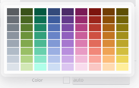
Tavolozza dei colori | Selezionare la tavolozza dei colori per questo grafico. Le tavolozze qualitative sono ideali per categorie di dati distinte. Le tavolozze sequenziali sono utili per le singole variabili. Le tavolozze divergenti possono essere utilizzate per valori che passano da un estremo all’altro. | ||
Sincronizza i colori | Se selezionata, tutti i widget sulla dashboard utilizzano lo stesso colore per lo stesso valore, se applicabile | ||
Anello | Mostra il grafico a torta sotto forma di anello | ||
Tipo di etichetta | Mostra chiave, valore o percentuale come etichette del grafico oppure non mostrare le etichette | ||
Etichette all'esterno | Posiziona le etichette all'esterno del grafico a torta | ||
Soglia delle etichette | Mostra solo le etichette relative ai valori superiori alla soglia configurata. Se il tipo di etichetta è una percentuale, una soglia del 10% deve essere configurata come 0,1 | ||
Min / Max | Definisce i valori minimo e massimo visualizzati sul grafico a pallini o a indicatore. Questi limiti possono essere specificati sia come valore numerico sia come durata temporale secondo lo standard ISO 8601 (ad es., | ||
Valore target | Specificare il valore target per il grafico a monitor o a pallini oppure lasciare vuoto per prelevare il valore target dalla configurazione dell’oggetto SKOOR | ||
Warning / Minor /Major | Definire le soglie per il grafico a indicatore o a pallini. Sono ammessi i segnaposto. Il grafico a indicatore (Gauge) consente di utilizzare Esempi:
| ||
Mostra asse X | Se selezionato, vengono visualizzate le etichette dell'asse X | ||
Mostra controlli | Attiva o disattiva i controlli per selezionare o deselezionare i valori nel grafico | ||
Mostra valori | I valori vengono visualizzati o meno nel grafico | ||
Mostra punti dati | Mostra i singoli punti dati che compongono il grafico | ||
Impilati | Impila i valori all'interno di un unico gruppo | ||
Colori separati per le pile | Se selezionata, l'ordine dei colori è lo stesso in tutte le pile del grafico, ma un colore non può essere associato a un determinato valore. Le opzioni "Sincronizza colori" e "Legenda" non possono essere selezionate insieme a questa impostazione | ||
Ruota le etichette | Angolo di rotazione delle etichette per evitare che si sovrappongano. Gradi da | ||
Precisione | Specificare il numero di cifre decimali da utilizzare per i valori | ||
Unità di riserva | Specificare l'unità di riserva da utilizzare quando la colonna non ha un'unità o l'opzione "Mostra unità" non è selezionata | ||
Y massimo | Il valore massimo rappresentato dal grafico sull'asse Y (sinistra, destra). Questo limite può essere specificato sia come valore numerico sia come durata temporale secondo lo standard ISO 8601 (ad esempio, | ||
Min Y | Il valore minimo rappresentato dal grafico sull’asse Y (sinistra, destra). Questo limite può essere specificato sia come valore numerico sia come durata temporale secondo lo standard ISO 8601 (ad es., | ||
Etichetta Y | L'etichetta da visualizzare sull'asse Y (sinistra, destra) | ||
Orientamento | Visualizza le barre in orizzontale o in verticale | ||
Configurazione dell’asse Y | Precisione dei valori, valori minimo e massimo, nonché l'etichetta visualizzata a sinistra e a destra dell'asse Y | ||
Etichetta dell’asse X | Etichetta da visualizzare sull’asse X. Può essere il nome di un oggetto SKOOR, una proprietà di un oggetto SKOOR o una colonna dell’origine dati | ||
Etichetta dell’asse Y | Etichetta da visualizzare sull’asse Y. Può essere il nome di un oggetto SKOOR, una proprietà di un oggetto SKOOR o una colonna dell’origine dati | ||
Pivot | Colonna della fonte dati, proprietà personalizzata o nome di un oggetto da utilizzare per la funzione pivot; "nessuna" se non utilizzata | ||
limite | Limita il numero di set di dati visualizzati, raggruppando i restanti valori nella categoria <ALTRI>. 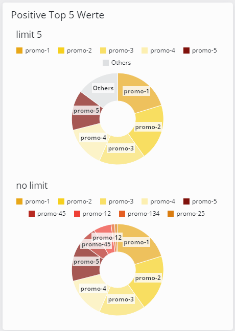
| ||
Espandi intervallo | I grafici a barre o misti possono espandere l’asse X, nel caso di valori di data, fino ai valori di inizio e fine dell’intervallo impostati tramite un selettore di date | ||
Dimensione del bucket | Raggruppare i dati in intervalli di tempo specifici (sull'asse X)
| ||
Tipo predefinito | Selezionare il tipo predefinito di rappresentazione della colonna pivot. | ||
Formato dell'ora | Specificare il formato utilizzato per la rappresentazione dell'ora | ||
Abilita lo zoom | Abilita lo zoom per questo widget. Funziona solo quando nella stessa dashboard è presente un widget Selettore di date e solo entro le dimensioni dei bucket consentite dal Selettore di date. Ad esempio, se il Selettore di date consente solo bucket giornalieri, non è possibile ingrandire oltre quel livello. |
Valore dell’oggetto SKOOR o colonna dell’origine dati
Selettore di colore:
Impostazione | Descrizione |
|---|---|
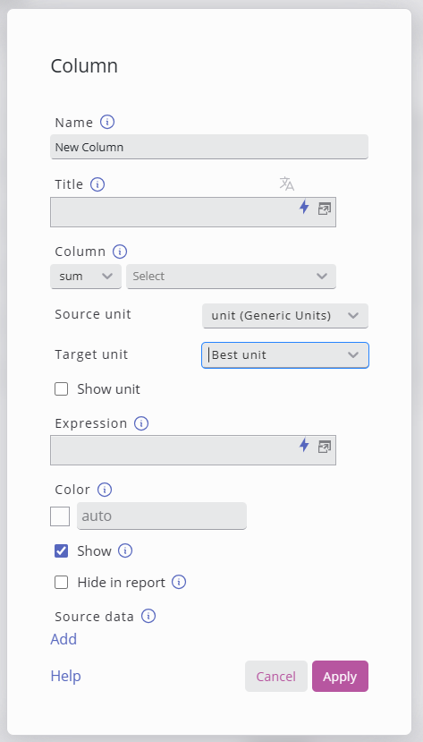
Nome | Nome della colonna come visualizzato nella legenda |
Titolo | Nome della colonna come visualizzato nella legenda |
Colonna / Valore | Valori aggregati di questa colonna / Colonna dell'origine dati o chiave del valore |
Unità di misura | L'unità di misura dei dati nella colonna. |
Unità di destinazione | L'unità di destinazione in cui convertire i valori. |
Mostra unità | Mostra l'unità nella legenda o nel popup al passaggio del mouse. |
Mostra previsione | Mostra la previsione (se configurata) per la colonna selezionata |
Configurazione delle previsioni | Seleziona la previsione da visualizzare nel grafico multiplo oppure lascia l'impostazione su "Auto" per selezionare una delle previsioni corrispondenti. |
Espressione | Utilizza le espressioni per calcolare il valore; per ulteriori dettagli, consulta: Segnaposto |
Colore | Colore della serie di dati |
Mostra | È possibile nascondere la colonna utilizzando questa opzione. |
Nascondi nel report | Nascondi colonna nel report PDF |
Tipo | Linea, area, a barre o a punti |
Asse Y | sinistra o destra |
Stile linea | Continuo, punteggiato o tratteggiato |
Livello di sfondo | Nessuno, regressione_lineare_semplice, media, mediana, minimo o massimo |
Azione al clic | Specificare un'azione da eseguire quando si fa clic su un elemento nel grafico. Sono disponibili i seguenti segnaposto: Tutti i tipi di grafico:
Monitor, Bullet, Gauge:
a torta:
A barre, multiplo:
A dispersione:
Se l'opzione "Ripeti" a livello di widget è abilitata:
Se i valori vengono caricati da SKOOR Engine:
|
Dati di origine (obsoleto dalla versione 9.1) | Definisce l’origine dati da utilizzare per recuperare e presentare le informazioni associate in seguito all’interazione dell’utente. |
La conversione delle unità è stata introdotta in SKOOR 8.1.
Consente all’utente di specificare l’unità di origine della colonna selezionata e l’unità di destinazione (inclusa l’unità ottimale).
Il convertitore gestirà la conversione e potrà mostrare l’unità nelle etichette/legenda del grafico.
L’opzione “Unità ottimale” analizzerà l’intera colonna e individuerà l’unità più adatta alla mediana di tutti i valori.
Sovrapposizione dei dati di origine (deprecata a partire dalla versione 9.1)
A volte, il testo semplice o le informazioni di origine aiutano a individuare la ragione alla base di determinati valori di un grafico. Con la sovrapposizione dei dati di origine, i dati possono essere visualizzati sotto forma di una semplice tabella, semplicemente cliccando su una barra del grafico:
La configurazione di questa tabella può essere effettuata individualmente su ciascuna delle colonne di un grafico a barre cliccando sull’icona a forma di ingranaggio:
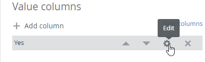
Un clic su «Aggiungi dati di origine» nelle impostazioni della colonna apre una nuova finestra di configurazione:

La configurazione dei dati di origine è identica a quella del widget tabella. Per filtrare i dati è possibile utilizzare tutti i parametri della dashboard corrente, nonché i grafici x, y, z (se applicabili) e i valori delle chiavi di pivot.
Parametro | Descrizione |
|---|---|
| Il valore della coordinata x del grafico (lo stesso vale per y e z) |
| Il nome della colonna o il valore pivot |
Esempio
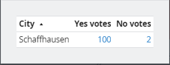
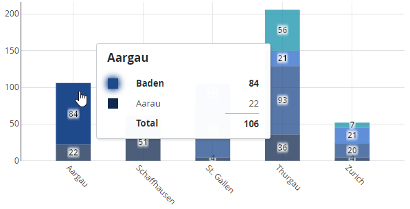
Il grafico seguente mostra i dati aggregati per stato (kanton) e città. Se si fa clic su una delle città (area colorata di una barra impilata), dovrebbero essere visualizzati i dati sottostanti:
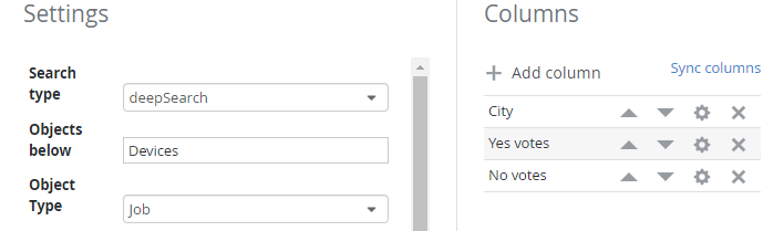
Ecco la configurazione della tabella dei dati di origine, che mostra il filtro dell’oggetto SKOOR e le colonne utilizzate per fornire i dati:
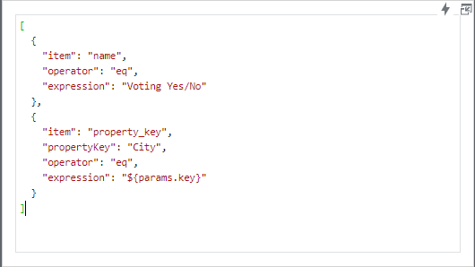
Nella sezione «Condizioni» della configurazione della tabella, il segnaposto ${params.key} viene utilizzato per filtrare i dati in base al nome dell’oggetto e alla proprietà personalizzata «Città»:
Cliccando su una delle aree colorate si aprono ora i dati di origine degli oggetti SKOOR, con le tre colonne configurate Città, Voti a favore e Voti contrari: