Chart
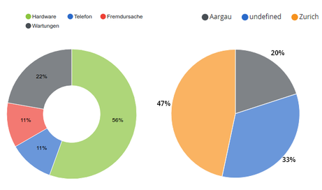
Charts can display either values of SKOOR objects or values from an external data source. Various types of charts are available.
Adding Source data overlay helps find the reason behind certain values in a chart.
Chart type | Example |
|---|---|
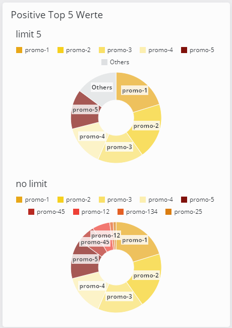
Pie | |
Monitorfor further details, check Monitor Chart | |
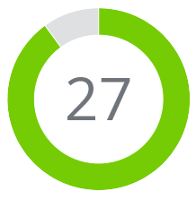
Single value | |
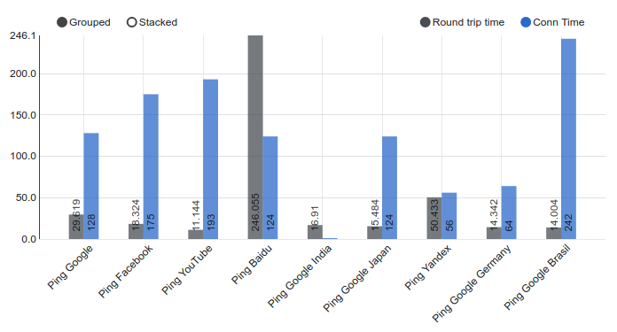
Barfor further details, check Bar Chart | |
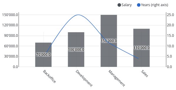
Mixed | |
Bullet | |
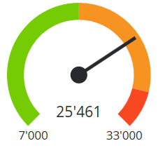
Gauge | |
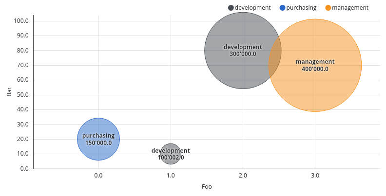
Scatter |
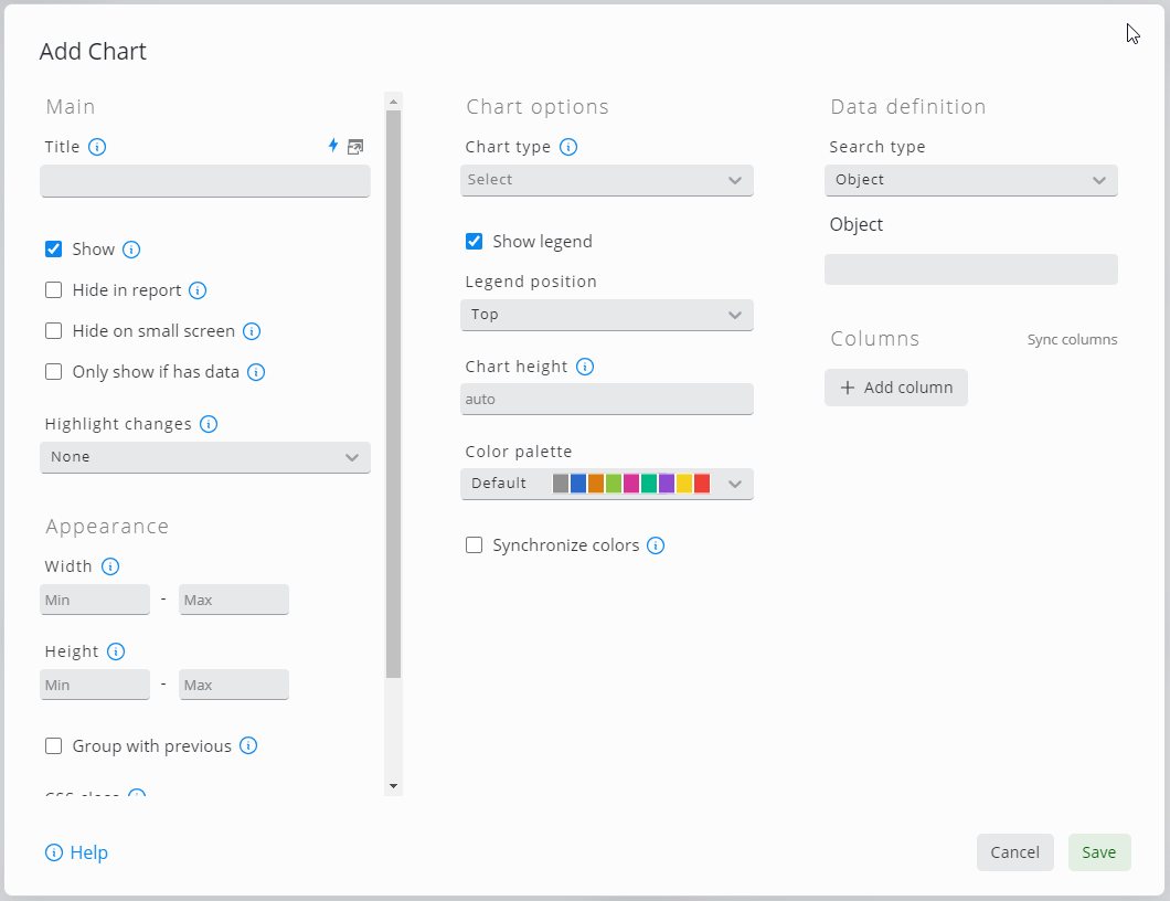
Editing the chart widget:
Setting | Description |
|---|---|
Chart type | Bar, Bullet, Gauge, Monitor, Mixed, Single, Pie or Scatter chart |
Search type | Data Source, Data Query or Object Filter settings. Every object or table row results in one data group in the chart. The settings following the search type depend on the chosen type |
Apply filter matrix query | If a filter matrix widget was configured in the dashboard, the chart will show values according to the current settings of the filter matrix |
Search query | Editor for datasource queries |
Order by | Define comma separated order of axis and values if applicable. Example: |
Legend | If checked, the legend can be configured to be shown at the top or the bottom of the chart |
Chart height | Height of the chart (without legend) in pixels |
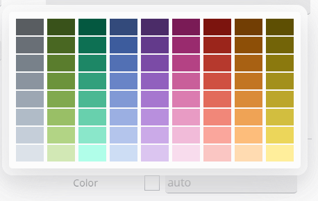
Color palette | Select the color palette for this chart. Qualitative palettes are best used for distinct data categories. Sequential palettes are useful for single variables. Divergent palettes can be used for values that transition from one extreme to another. |
Synchronize colors | If selected, all widgets on the dashboard use the same color for the same value if applicable |
Donut | Show Pie chart in the form of a donut |
Label type | Show key, value or percent as chart labels or do not show labels |
Labels outside | Place labels outside of Pie chart |
Label threshold | Show only labels for values above the configured threshold. If the label type is a percentage, a threshold of 10% must be configured as 0.1 |
Min / Max | Lowest and highest value to display with Bullet or Gauge chart |
Target | Specify target value for Monitor or Bullet chart or leave empty to take target value from SKOOR object configuration |
Warning / Minor /Major | Define thresholds for Gauge or Bullet chart. Allows placeholders. The Gauge chart allows to use Examples:
|
Show X axis | X axis labels are displayed if checked |
Show controls | Switch on or off controls to select or deselect values in the chart |
Show values | Values are or are not shown in the graph |
Show data points | Show the single data points that builds the chart |
Stacked | Stack values inside one group |
Separate stack colors | If selected, the order of colors is the same in all stacks of the chart but a color can not be associated with a certain value. Synchronize colors and Legend can not be selected together with this setting |
Rotate labels | Angle to rotate the labels so they do not overlap. Degrees from |
Precision | Specify the decimal places used for values |
Max Y | The maximum value represented by the chart on the Y-Axis (left, right) |
Min Y | The minimum value represented by the chart on the Y-Axis (left, right) |
Y Label | The label to display on the Y-Axis (left, right) |
Orientation | Display bars horizontal or vertical |
Y Axis configuration | Precision of values, min and max value as well as the label shown on the left and right Y axis |
X Axis Label | Label to display on the X Axis. Can be either a SKOOR object name, a SKOOR object property or a data source column |
Y Axis Label | Label to display on the Y Axis. Can be either a SKOOR object name, a SKOOR object property or a data source column |
Pivot | Datasource column, custom property or object name to use for pivot function or none if not used |
limit | Limit the number of shown Data Sets, by collecting the rest of the values in <Others> Category.
|
Expand Interval | Bar- or Mixed-Charts can expand their X axis in case of date values to the interval begin and end values set by a date picker |
Bucket size | Abstract the data in specific time intervals (on the X-Axis)
|
Default type | Select the default type of the pivot column’s representation. |
Time format | Specify the format used for time representation |
SKOOR object value or data source column
Color picker:
Setting | Description |
|---|---|
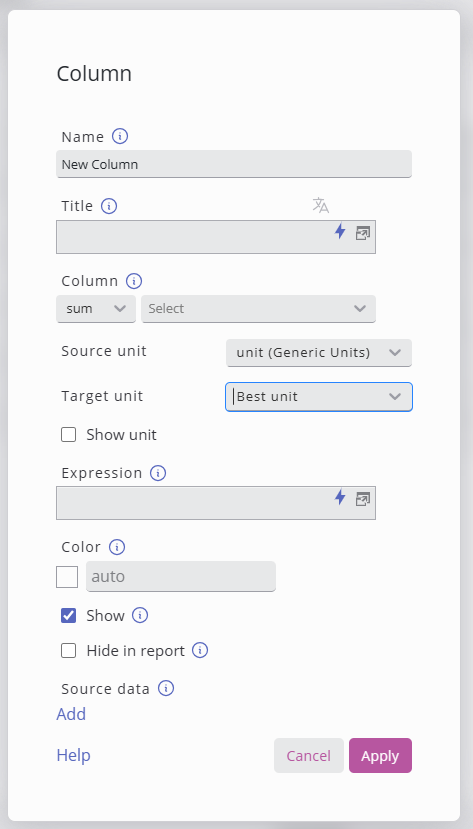
Name | Name of the column as displayed in legend |
Title | Name of the column as displayed in legend |
Column / Value | Aggregate values of this column / Data source column or value key |
Source unit | The unit of the data in the column. |
Target unit | The target unit to convert the values to. |
Show unit | Show the unit in Legend/Hover overlay. |
Expression | Use expressions to calculate the value, more details in: Placeholders |
Color | Color of the data serie |
Show | Column can be hidden using this option. |
Hide in report | Hide column in PDF report |
Type | Line, area, bar or scatter |
Y axis | left or right |
Line style | Solid, dotted or dashed |
Background layer | None, simple_linear_regression, avg, median, min or max |
Source Data | Defines the data source to be used to retrieve and present associated information upon user interaction. |
Unit conversion is introduced in SKOOR 8.1
It allows the user to specify the source unit of the column selected, and the target unit (incl. Best unit).
The converter will handle the conversion and can show the unit in the Labels/Legend of the chart.
Best Unit would evaluate the whole column and find the best fitting unit for the Median of all the values.
Source data overlay
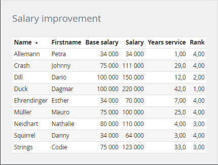
Sometimes, plain text or source information helps finding the reason behind certain values of a chart. With the source data overlay, data can be displayed in the form of a simple table, just by clicking a bar of a chart:
The configuration of this table can be made individually on each of the columns of a bar chart by clicking the gear wheel:
A click on Source data Add in the column settings opens a new configuration window:
The source data configuration is the same as the table widget. All parameters of the current dashboard as wells as the charts x, y, z (if applicable) and pivot key values can be used to filter data.
Parameter | Description |
|---|---|
| The value of the x coordinate of the chart (same applies for y and z) |
| The column name or pivot value |
Example
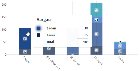
The following chart shows data aggregated by state (kanton) and city. If one of the cities (colored area of a stacked bar) is clicked, the underlying data should be displayed:
Here is the source data table configuration, showing the SKOOR object filter and columns used to provide the data:
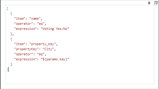
In the Conditions section of the table configuration, the ${params.key} placeholder is used to filter data by object name and the custom property City:
A click on one of the colored areas now opens the source data of the SKOOR objects, with the three configured columns City, Yes votes and No votes:
