Inventory
The inventory widget displays configurable parts of the SKOOR object tree, database tables or data queries.
Horizontal orientation:
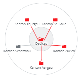
Circular orientation:
Vertical orientation:
Editing inventory widget
To configure an inventory tree, choose Engine or Database as data source first:
The dialog will change according to the source setting.
Source Engine
Root object
A single object that is used as root of the displayed inventory tree. If more than one object matches the search criteria, only the first one is displayed. If there is no need to search an object dynamically, the preferred search type is Object.
Opened objects
The inventory tree will be spawned from the root object to the objects selected in this section.
Source Database
As in many other widgets, set the search type to either data source or query and select a table, view or data query from the list.
This widget requires a defined set of columns from the data source or query:
Column | Description |
|---|---|
id | Unique key |
name | Name of the outmost elements (leaf elements) of the tree structure |
type | Type of the leaf elements (defines leaf icon). Types can be any of the SKOOR object types like device or subtypes like device_router. See SKOOR Engine object types for further details |
state | State of leaf elements. valid states are major, minor, warning, ok, maintenance_major, maintenance_minor, maintenance_warning, maintenance_ok, undefined and nodata |
level_0 | Elements connected to the root element |
level_1 | Elements connected to level_0 elements (optional) |
level_n |
Settings
The following properties can be set in the widget
Setting | Description |
|---|---|
Apply filter matrix query | If a filter matrix widget is present on the dashboard, it will be applied to this widget as long as fields of the filter match fields of the inventory source |
Manual navigation reset timeout | To drill down the inventory tree, objects can be clicked to make the child objects visible. After this timeout, the inventory will be reset to the opened objects definition |
Orientation | Choose between a horizontal, vertical or circular object tree |
Show level circles | Enable or disable lines between child object levels. This setting is visible when the orientation is set to circular |
Opened action | Define if and when objects in the tree below the opened objects are displayed:
|
Ctrl Zoom | Zooming is enabled only while pressing the Ctrl-button on the keyboard. |
Click action | Specify the action to be done upon clicking on one of the elements. Details of Click actions |


