Hotspot Map
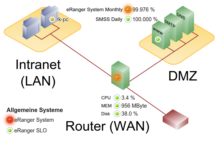
The Hotspot Map consists of a background picture and freely placeable Hotspots. These Hotspots behave differently depending on their type and configuration.
Hotspots are mostly linked to SKOOR objects and show their state or value. If a Hotspot links to a SKOOR object, it can be clicked to show its drilldown- / detail-view.
Hotspots can be assigned an opacity between 0 and 100 %.
The following types of Hotspots are available:
Lightbulb
Lightbulbs are stylized dots/bulbs that can take on various colours, depending on their configuration and state. To emphasize Hostspots that have a bad state Lightbulbs can be configured to flash once the state of the underlying object is equal to or worse than a predefined state.
Lightbulbs can be labelled using various object properties (see Label).
Label
Labels can contain simple text or an alphanumeric value consisting of a linked SKOOR object property (its name, a specific property, parameter or value).
Text
This type of Hotspot can only contain literal text and cannot be linked to an SKOOR object.
Rectangle
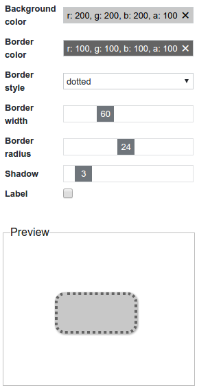
A Rectangle Hotspot can be used to graphically design a Hotspot widget. The background colour, border colour, its style and width as well as the corner rounding radius can be configured. Additionally, a shadow and a label can be defined.
Icon
Any bitmap icon can be used as a Hotspot. Several state-dependent icons can be defined per Hotspot.
An icon can also be labelled (see Label).
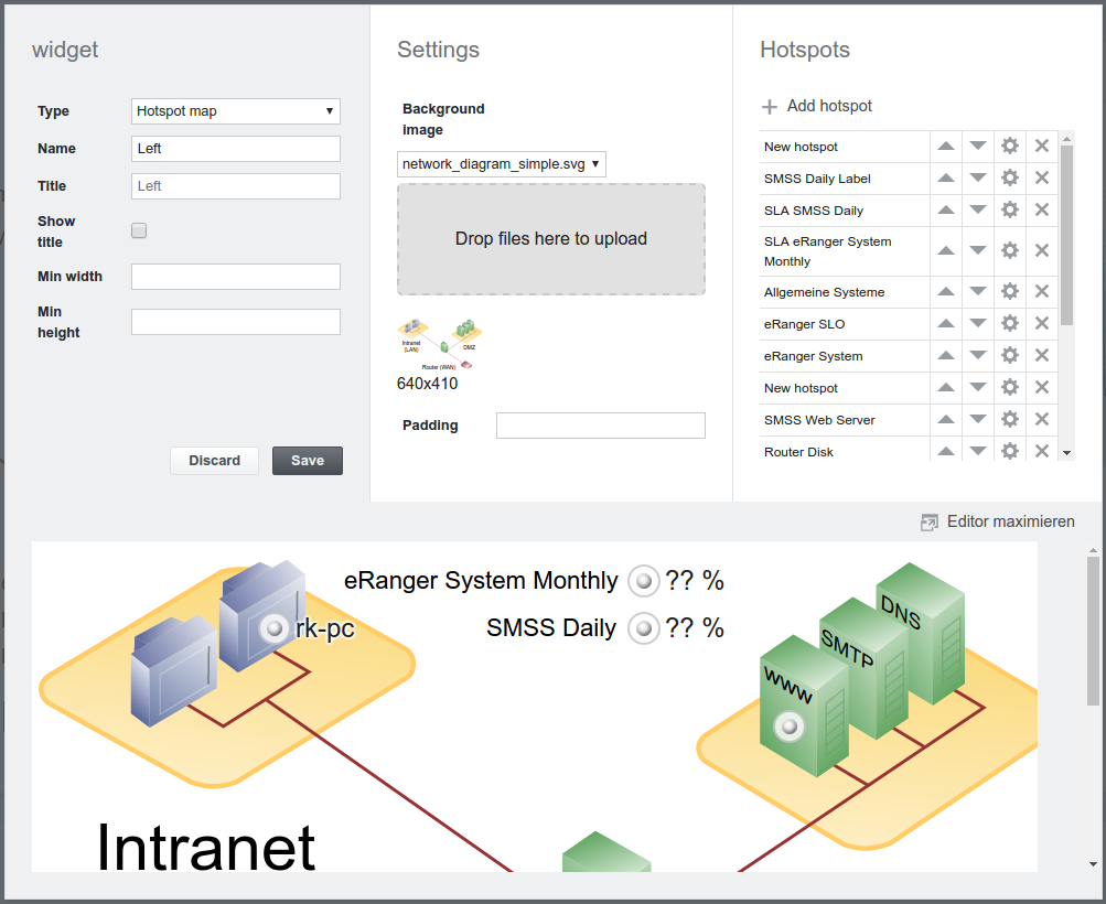
Editing hotspot map widget
Setting | Description |
|---|---|
Background image | Image to use as widget background. Can be a bitmap or SVG image. Images can be uploaded by either dropping a file inside the dashed grey area or clicking it to browse for a file. |
Padding | Padding of the background (optional, in pixels). The padding can be defined in different ways:
|
Map editor
Maximize / Minimize
The editor area can be maximized / minimized by clicking on the editor's background or on the Maximize / Minimize editor button.
Add hotspot
Add hotspots by clicking on the Add hotspot button.
Select hotspots
A hotspot can be selected by clicking on it in the editor. Multiple hotspots can be selected by either pressing the ctrl key while clicking on a hotspot or by using the rubber band tool.
All hotspots can be selected by pressing ctrl+a.
Move / Resize hotspot
Selected hotspots can be moved or resized by Drag&Drop or using the arrow keys on the keyboard. Hotspots move 10 px per key press. To achieve more fine grained movements, the ctrl key can be pressed while using the arrow keys.
Snap lines help properly align multiple hotspots against each other.
Copy hotspot
Select the hotspot of your choice. Press ctrl+c and ctrl+v to get a copy of the hotspot on your map. Move the new object to the correct place on the map and configure it as usual.
Delete hotspot
Delete a hotspot by clicking the X button next to it.
Edit hotspot
A hotspot can be edited by either double-clicking it or clicking its gear wheel button in the hotspot list.
Setting | Description |
|---|---|
Type | lightbulb (default), label, text, rectangle, icon. |
Name | Name to identify the hotspot in the hotspot list. |
Position | Coordinates in pixels relative to the hotspot map origin (top left corner). |
Size | Size of the hotspot in pixels |
Opacity | Opacity of the hotspot (0 - 100%, default is 100%) |
Clickable | By default clicking on a hotspot opens its details view. This can be deactivated with this setting. |
Click action | Specify an action to be done, when an object on the map is clicked. |
Hotspot types
Setting | Description |
|---|---|
Frame | Show or hide frame around the lightbulb: vs. |
Default status | Displayed state of the lightbulb as long as no data is loaded. |
Flash threshold | Threshold state at which the lightbulb should start to flash. |
Label | Activate label. |
Label
A label can be a hotspot itself:
The same settings are available for the label as shown above in the Lightbulb section.
Instead one can also display a label connected to a hotspot.
Text
Free formatted text can be added using the Text hotspot:
Rectangle
Setting | Description |
|---|---|
Background color | Click to select the background color using a color chooser. |
Border color | Click to select the border color using a color chooser. |
Border style | Solid (default), dashed, dotted, double. |
Border width | Border width in pixels. |
Border radius | Border radius in pixels. Perfect circles can be achieved by setting this value to its maximum. |
Shadow | Drop shadow width in pixels. |
Label | Activate label. |
Icon
Use the Icon hotspot to add custom state-dependent lightbulbs:
Setting | Description |
|---|---|
Default Status | Displayed status as long as no data is loaded. |
Default icon | Displayed icon if no state dependent icon is defined. |
State dependent icons | One icon per state can be defined. |
Label | Activate label. |
Labels
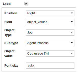
Some hotspots have the ability to display a label next to it. To show a label, simply activate the Label checkbox.
Setting | Description |
|---|---|
Position | Bottom, left, top, right |
Field | The field to display
|
Text | Only visible if field is hotspot_text. Text to display |
Object type | Only visible if field is object_values, object_parameters or object_properties. Type of selected object |
Sub Type | Only visible if field is object_values or object_parameters. Sub type of the selected object. |
Object value | Only visible if field is object_values. Displayed value. |
Object parameter | Only visible if field is object_parameters. Displayed parameter. |
Object property | Only visible if field is object_properties. Displayed property. |
Font size | The label font size in pixels. |


