Widgets
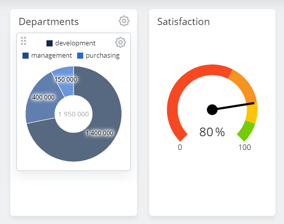
Widgets are the building blocks of a dashboard and are divided into 3 main categories:
Editing widgets
Move widget
Widgets can be moved by clicking and holding the drag & drop button on the top left of the widget (shown only when hovering over the widget). An outline shows where the widget will be placed when released.
Edit mask
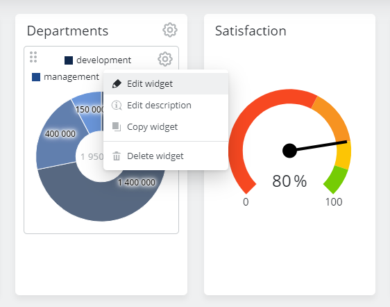
The edit mask can be opened by clicking the Edit button:
This opens the widget edit dialog.
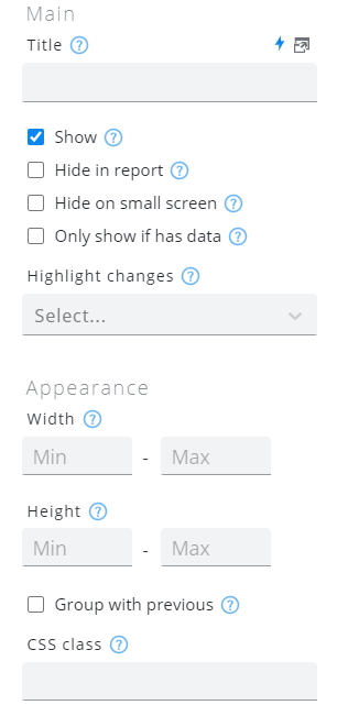
The left side of the edit mask contains the widget's general settings, whereas the right side contains settings pertaining to the selected widget type.
Setting | Description |
|---|---|
Version | Dropdown at the top right corner of this dialog. 5 versions of a widget are kept to be able to rollback changes |
Show | Widgets can be hidden using this option. |
Title | Displayed title |
Hide on small Screen | Widgets can be hidden on small screens (phones) using this option. |
Only show if has data | Some widgets can be configured to only show if they actually have data. The widget is not shown during loading and will only be displayed after loading, if it has data. |
Highlight changes | If this option is set, widgets will be highlighted when their data has changed. The option "visual" makes the widget blink for 10 seconds, while "audio" additionally plays a quick notification sound. |
Hide in report | This specifies whether this particular widget should appear in PDF reports, when such a report is configured for the current dashboard. |
Width | Minimum width of the widget in pixels or percent (optional). If Min width is not specified, widgets are automatically sized based on the available space. To align two widgets strictly side by side, set Min width to "50%" for both of them. To force a widget to use the tile's full width, set Min width to "100%". Maximum width of the widget (optional). If set, best results are achieved when a minimum width is also defined. To avoid unreadable graphs, the minimum width should be configured in pixels instead of percent. |
Height | Minimum height of the widget (optional). This is useful for widgets which don't define a height by themselves (e.g. Geo Map). Maximum height of the widget (optional). |
Group with previous | Can be used to tie widgets together. In the following example Grouped widget 2 has Group with previous activated. |
CSS Class | Assign a custom CSS class to this particular widget (optional). |
Repeat | Use the repeat function to create multiple widgets of the same type for each entry in the result set of the query selected. more info |
Widget Preview
Repeat widget
The repeat widget is currently only available for Chart and Text widgets.
The repeat option of a widget would repeat an entity of the widget for each entry found in the result set of the query.
This makes it easy to create repetitive widgets based on repetitive data.
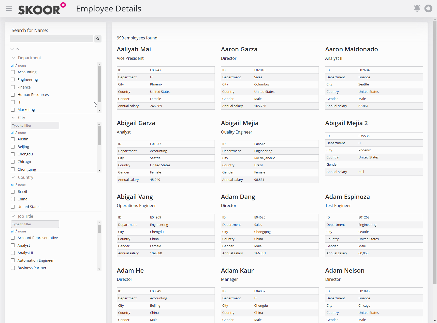
In the example below, a table with Employees' information is accessed, and for each employee(row) a text widget is created.
The iterator used is loopRow, so if each row of the result set has a name column, we can use: loopRow.name to access that column’s value.
Delete widget
To delete a widget, use the Delete Widget option in the edit menu of the widget.


