Show value history
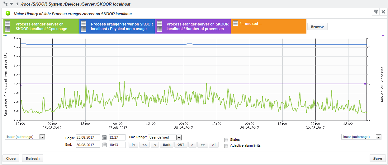
A value history can be shown for job objects. Within a Value History graph, a maximum of 4 measurements from only one or from different jobs can be overlaid. By default the value history shows predefined values, depending on the type of the job. Below the graph the time range and the graph configuration can be changed in various ways (manual time range, skipping to next time interval…).
Vertical axis configuration
The location of the vertical axis is indicated by the small colored dots in the upper left and right corners of the graph pane. In the example above, the green and blue values share the same vertical axis on the left, whereas the purple value uses the vertical axis on the right.
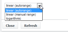
Value display can be linear (auto or manual) or logarithmic. Autorange will adjust the vertical scale automatically based on the values visible within the chosen time range.
Value selection
Move the cursor over the upper left icon on one of the four colored areas above the graph and a list of selected jobs and selectable measurements will pop up. Click on a value to select and press Refresh at the bottom of the screen.
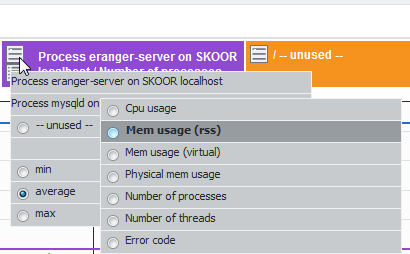
To show additional values from different jobs, select the desired jobs with the Browse function first, then assign them to a colour as described above.
Value statistics
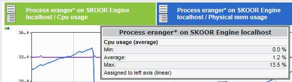
Mouse-over shows the measurement values of the currently selected job in the displayed time range. For most jobs the data shown are minimum, maximum and average values.
The minimum, maximum and average display does not make sense for enumerated values like error codes, response codes, SNMP and Parse file enums. Every number for this kind of job has its own meaning, therefore the mouse-over will display its index. The minimum, average or maximum view influences views where multiple measurements per pixel are displayed.
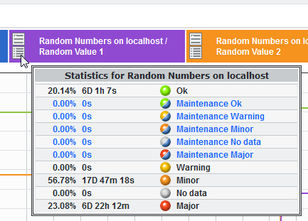
Moving the cursor over the lower left icon on one of the four colored areas will open a state statistics window for the selected job value:
Zooming
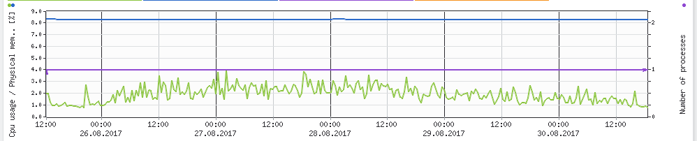
Zooming into a graph is done by first clicking the graph at the start time, then clicking the end of the desired time range and finally clicking anywhere between those two boundaries.
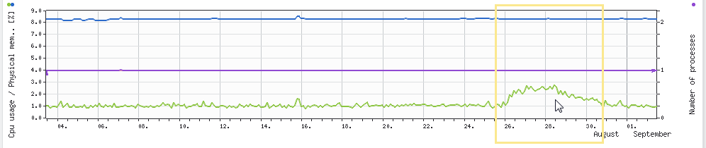
The graph will be refreshed immediately and show the selected time range:
Adaptive alarm limits
If a job is configured with adaptive alarm limits (see section Edit alarm limit (job)), those alarm limits can be shown also by selecting the Adaptive alarm limits checkbox below the graph.
The following figure shows an example of a single value with adaptive alarm limits configured for Minor (orange) and Major (red) states:
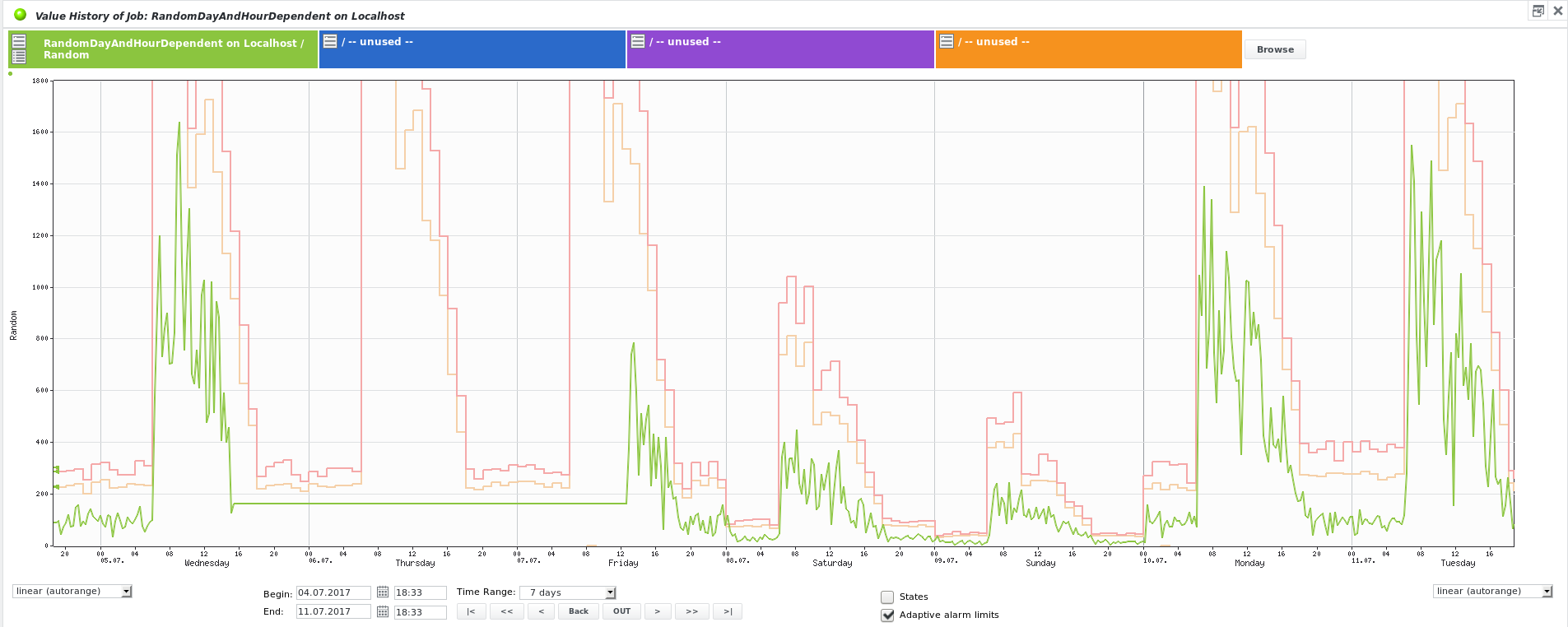
The adaptive alarm limits are not displayed immediately for newly created jobs. The SKOOR Engine needs a certain history timerange of measured values to calculate the statistics required for the adaptive alarm limits.
When jobs are in state no data or undefined, data series will be interrupted. If the data of the same period of time is delivered later, these gaps will be filled again.