Layout
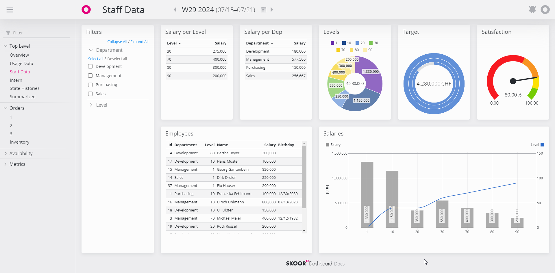
The layout of SKOOR Dashboard.
Space allocation
The layout engine is working with a predefined structure of tiles that must be set at creation time of the dashboard. This structure can be changed at any time later on, but widgets must be moved to fit the new structure again.
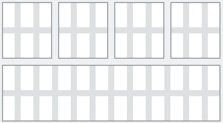
The dashboard layout is based on a 12 columns grid:
A row can therefore be subdivided into a maximum of 12 units. For example, the grid can be divided using the pattern:
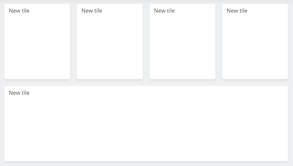
These column- and line-blocks form the dashboard Tiles. The above tile layout results in the following dashboard:
Resizing content areas
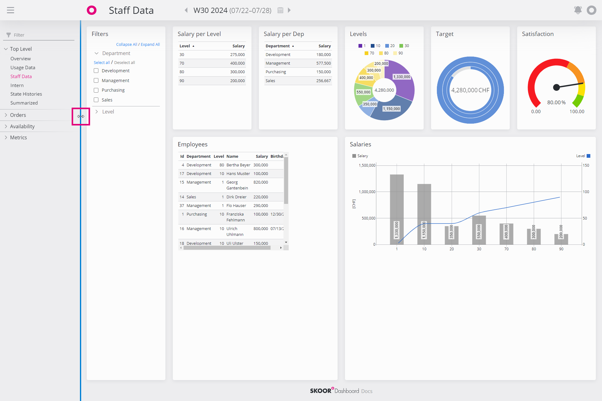
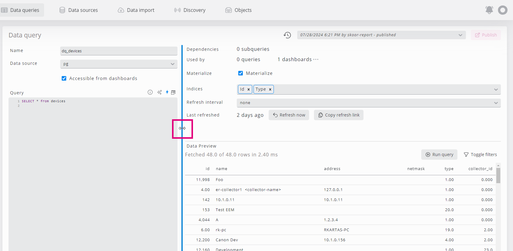
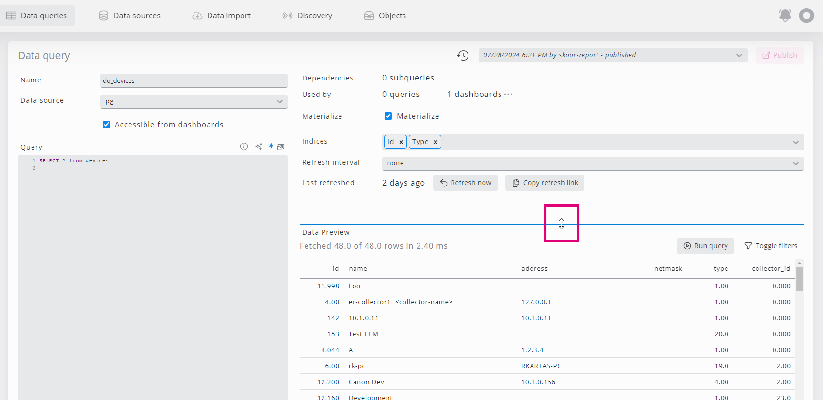
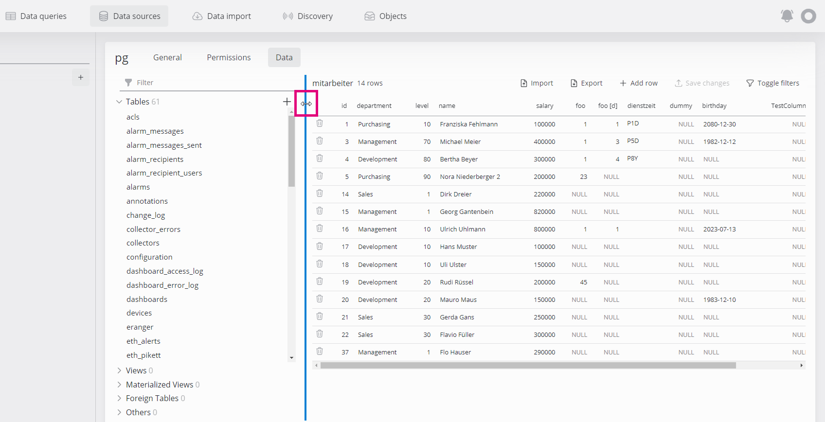
You can change the size of the different content areas by dragging the dividing line and thus adjust the space as required.
This is particularly helpful when working with data sources and data queries.
Responsiveness
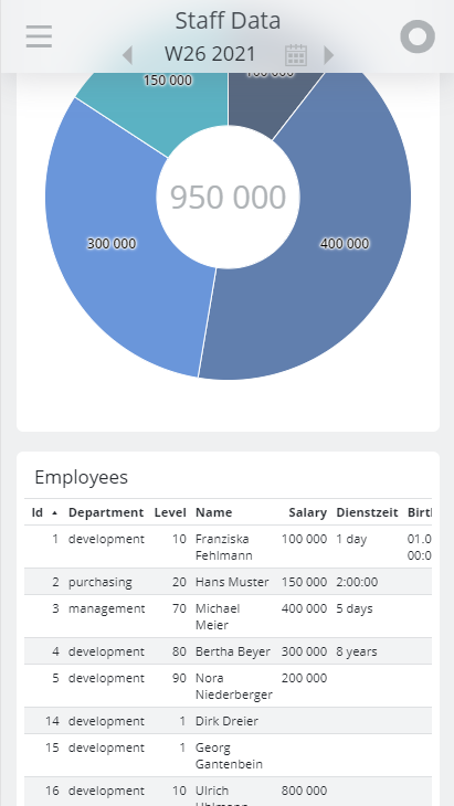
The dashboards are responsive to the size of the browser window. The tiles adapt automatically when resizing the browser window to fit the available space in an optimal way. On mobile displays the tiles are displayed one below the other.
