 Docs
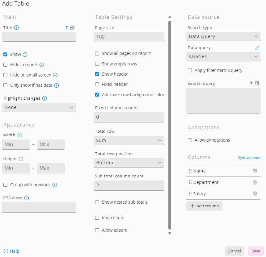
DocsEdit Table
Basics
The table configuration is divided into two parts.
In the first part, general table settings are configured such as the table header, number of rows per page or aggregation functions
The second part, the Data Source section, is all about the actual data in the table, mainly generated by SKOOR objects or stored in a database. In this section, data can be loaded, filtered, paraenriched by overlays and so on
SKOOR objects can be loaded using an object filter. Every object generated by the filter results in one row in the table
Databases can be queried using the search type Data Source (tables or views) or Data Query (SQL)
Table Settings
Setting | Description |
|---|---|
Page size | Number of rows which are visible per page. If there are more rows, a page selector is shown  |
Show all pages in report | If unchecked, only the first page of a paged table will be visible in reports |
Show empty rows | Show empty rows if the number of rows is lower than Page size. 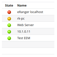 |
Show header | Show or hide table header. Please note that default column filters are always used, even if a column or the whole header is hidden |
Fixed header | The header keeps visible when the rows are scrolled vertically |
Alternate row background color | Adjacent rows are displayed in slightly different colors to increase readability |
Fixed columns count | Number of Columns starting from left that will remain visible when scrolled horizontally |
Aggregate row | Adds a row with aggregated values to the table.
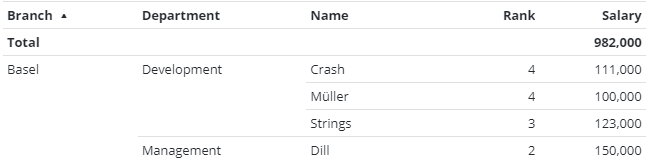 |
Aggregate row position | Display aggregated values on top or at the bottom of the table |
Sub-aggregate column count | Adds an aggregation row based on one or more columns
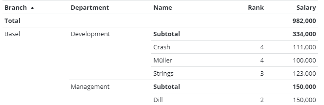 |
Show nested sub aggregates | Adds a subtotal over an aggregated value group. The following example shows the total of all branches plus the subtotal per branch and department 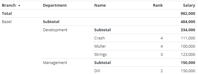 |
Keep filters | If Keep filters is active, dynamic column filters are not cleared on a page change |
Allow export | Data can be exported to CSV or XLSX formats |
Data Source
Setting | Description |
|---|---|
Search Type | Select the reqired data source. The fields of the data source part of the configuration change according to the search type |
Object, Objects below | Select one or more SKOOR objects using the common object filters |
Data Source | Select a database. Databases are configured in the Data and Objects section |
Table | Select one of the tables or views of a database |
Data Query | Select a Data Query. Data Queries are configured in the Data and Objects section |
Apply Filter Matrix Query | If a filter matrix widget is configured on the dashboard, filters of that widget are applied if the columns of both widgets match |
Search Query | Define filters as described in Data source query editor |
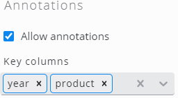
Annotations
Check Allow annotations to enable the annotations feature. Make sure one or more columns are defined as key here which is used to map each annotation to a data row:
Columns
Click Sync columns to add all available columns from the configured table or data query. If only a subset of the available columns are used, click Add column to add columns or delete the unused ones after syncing all of them. To change the column order, just drag & drop column items.
Open the settings by clicking a column item:
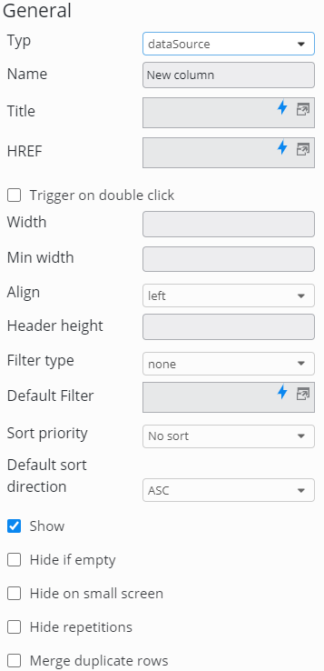
Setting | Description |
|---|---|
Type | Column type dependent on the Search type defined in the Data source section of the widget
|
Name | Name of the column. This is displayed in the table header |
HREF | Link (optional). Can be absolute or relative and can use placeholders |
Trigger on double click | The link defined in the HREF field is only triggerd by a double click |
Width | Exact width in pixels or % (optional) |
Min width | Minimal column width in pixels or % (optional) |
Align | Align text left, centered, or right |
Header height | Height of the header in pixels |
Filter type | Type of dynamic filter
|
Text match | Only available if Filter type is set to Defines the table filter behaves.
The wildcard character |
Default filter | The dynamic filter text can be preset. Please note that the filter is active even if the column is not shown |
Sort priority | Set a sort priority to make the column sortable. Rows are sorted according to the sort priority. If two columns have the same sort priority, the priority is determined by the column precedence |
Default sort direction | Sort ascending or descending per default |
Show | Whether to show the column (default) or not. Please note that default filters are active even for hidden columns |
Hide if empty | Hide the column if no table cow contains a value for this column |
Hide on small screens | Hide the column if it does not fit into the screen |
Hide repetitions | Hide repetitive values. This can be used to achieve a kind of grouping: 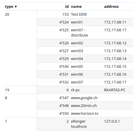 |
Merge duplicate rows | Show only one of all rows with the same value in this column |
Show aggregated value | Switch on or off this value in aggregation rows on top or below the table |
Header direction | Horizontal or vertical header. If you choose vertical, you have to set Header height to an appropriate value (due to technical reasons, the header size can't be determined automatically) |
Display as HTML | Interpret HTML tags in this column |
Column types
Name
Displays the name of the row object. No settings available.
Type
Displays the type of the row object. No settings available.
Sub type
Displays the sub type of the row object. No settings available.
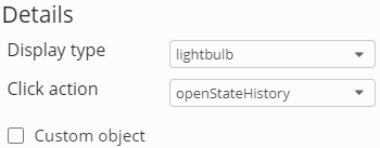
State
Displays the state of the row object as lightbulb or text.
When the search type returns SKOOR objects, the click action may be defined for the column. By activating Custom object you can show the state of an arbitrary SKOOR object (selected by object filter).
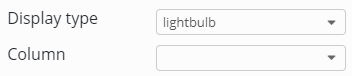
When search type is data source or data query, select the column that contains the required states from the Column dropdown:
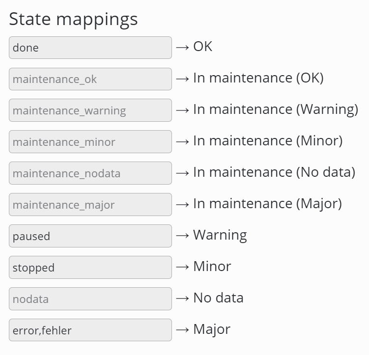
If the state column is used on a data source or data query based table, values can be mapped to states (SKOOR Dashboard >= 7.1.2).
To map multiple values to one state, values can be defined as a comma separated list.
State statistics
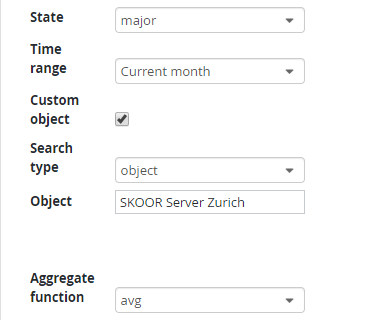
Calculates the percentage of the object being in the selected state. If a custom object is configured in the column, more than one object can be selected by the search filter. All objects are aggregated by the selected aggregate function in this case.
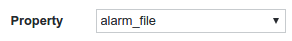
Property
Displays a property of the row object.
Count
Counts objects based on an object filter.
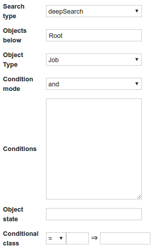
The Conditions field accepts the usual placeholders.
To get a reference to the row object one can use the following condition snippet:
{
  "item": "id",
  "operator": "eq",
  "expression": %id%
}
It is also possible to set a custom class for a given count. This is especially useful for coloring counts greater than a specified value:
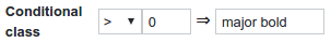
Useful classes:
bold
major
minor
warning
ok
Value
Displays a value of the row object. By activating Custom object you can show the value of an arbitrary SKOOR object (selected by object filter).
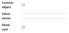
The value can be defined by its value key. Return values and string values accept the index in array notation (e.g. returnValue[0]) or the name of the defined unit.
Device name
Displays the name of the related device if the object is a job.
Parent
Displays the parent object of the corrent object.
Reasons
The reason why objects are in a state like major, minor or warning.
Message
Displays job info message if available.
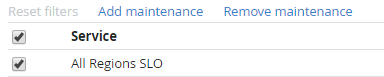
Select
Adds options to add or remove maintenance as well as a checkbox to each row.
Maintenances
Diaplays current maintenances.
Data source
Displays a column value of a data source table.
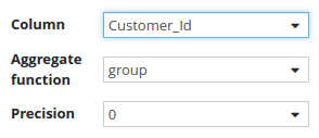
The aggregate function can be set to aggregate values of the column.
If the column is of type float, it is possible to set the precision of the value.
Data Query
Displays a column value of a data query. The same configuration options as for data sources apply also for data query columns.
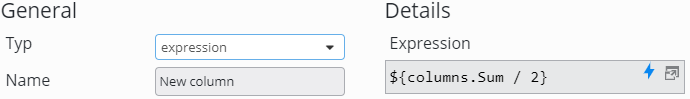
Expression
Expression columns can calculate values from other columns configured in this table widget. Other columns can be referenced in two ways:
${columns.<column name>}
${columns[“<column name”]}
As <column name>, set exactly the name configured in the respective column (e.g. capital letter at the beginning)
Please visit also the Placeholders page for details.
Annotation
With this column type, users may enrich the data of a data source or data query by annotations. There are five types of annotation columns:
Button | Adds a button to each row of the table to add annotations. Also, a fixed set of states can be configured here with possible transitions between them. Click the Add button to add states: 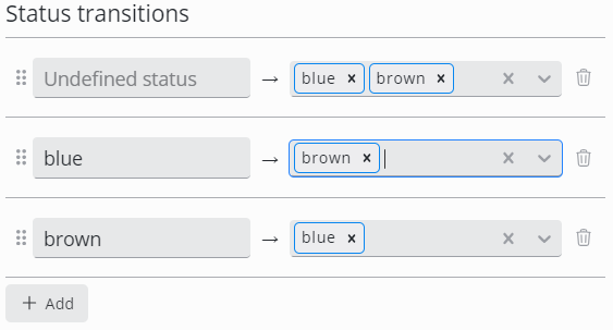 A transition from the undefined state must be configured. Otherwise, no annotations can be added at all |
Status | Display the current annotation status of each row |
Description | Display the current annotation description |
Created | Display the date the annotation was created |
User | Display the user that created the annotation |
Please visit the Annotations page for further details.
Advanced column settings
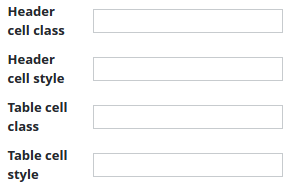
It is possible to customize the style of each table cell using CSS. This can be done by either using inline CSS (Header cell style, Table cell style) or CSS classes which can be defined in the Style settings of a dashboard.