Source data overlay
Sometimes, plain text or source information helps finding the reason behind certain values of a chart. With the source data overlay, data can be displayed in the form of a simple table, just by clicking a bar of a chart:
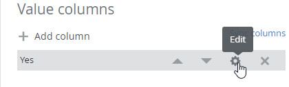
The configuration of this table can be made individually on each of the columns of a bar chart by clicking the gear wheel:
A click on Source data Add in the column settings opens a new configuration window:

The source data configuration is the same as the table widget. All parameters of the current dashboard as wells as the charts x, y, z (if applicable) and pivot key values can be used to filter data.
Parameter | Description |
|---|---|
| The value of the x coordinate of the chart (same applies for y and z) |
| The column name or pivot value |
Example
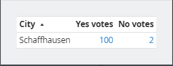
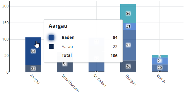
The following chart shows data aggregated by state (kanton) and city. If one of the cities (colored area of a stacked bar) is clicked, the underlying data should be displayed:
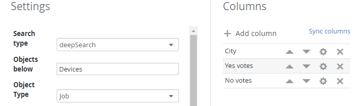
Here is the source data table configuration, showing the SKOOR object filter and columns used to provide the data:
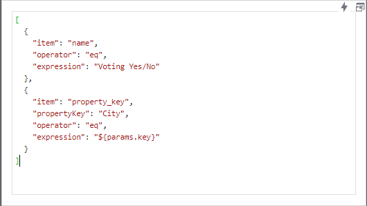
In the Conditions section of the table configuration, the ${params.key} placeholder is used to filter data by object name and the custom property City:
A click on one of the colored areas now opens the source data of the SKOOR objects, with the three configured columns City, Yes votes and No votes: