Edit Value History
Settings
To create a new Value history widget:
- Add one or more data series,
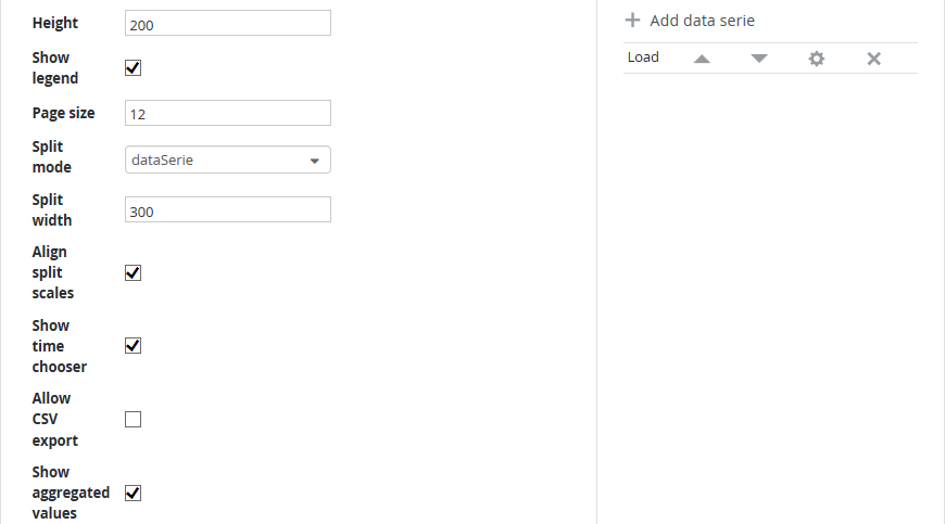
- Choose plot height (optional),
- If the same data series should be displayed for multiple objects, configure Page size, Split mode and Split width (optional),
- Enable or disable CSV export of the data displayed in the widget,
- Switch on or off the aggregated values table below the widget,
- Configure Y axes (optional),
- Choose a time range on the X axis (optional).
Add data series
Click the Add data series button to add a new data series.
The first step is to define one or more SKOOR Engine objects to get data from. Click add data serie and use the object filter to select the appropriate objects.
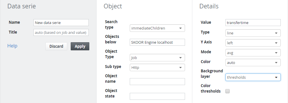
The following settings can be configured for each Data series item:
| Setting | Description |
|---|---|
| Name | Name of the data series. This is used to identify the data series in the data series list of the value history edit mask. |
| Title | Custom data series title used in the legend (optional). |
| Value | Some SKOOR Engine objects offer more than one measurement value. Choose the value to get history data for. The section List of job/SLC value keys gives you an overview of the |
| Type | Line or area (Default is line). |
| Y Axis | Choose which of the 2 vertical axes to use for plotting this data series (Default is left). |
| Mode | Choose the sample mode (optional): avg (Plot average value for each time sample. This is the default), max (maximum value) or min (minimum value). For details see Value History |
| Color | Custom color (optional). |
| Background layer | The value history can be enriched by state or threshold information. Choose one of none, states or thresholds |
| Color thresholds | If checked, thresholds will be displayed in their well known colors, otherwise in gray shades. This option is only visible when the background layer is set to thresholds. Note that thresholds with operator <> can not be displayed |
Choose plot height
By default, the height of the plot is determined automatically. However, using the Height field, a custom plot height can be specified (in pixels).
Split graphs / Aggregate values
If data of more than one object should be displayed, it might be a good choice to split the data series up into more than one graphs. This can be done either by object or by data series.
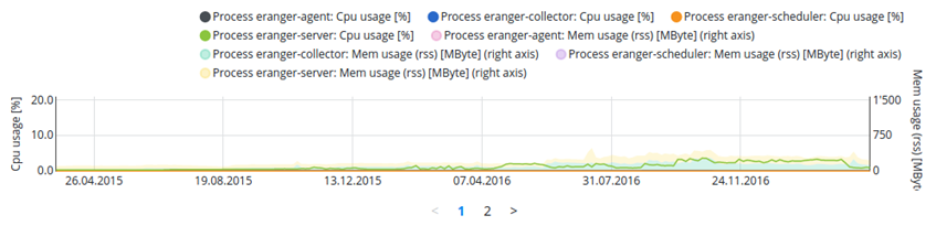
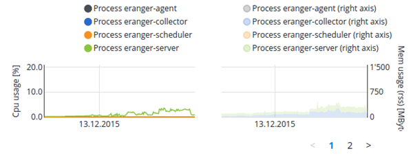
The following picture shows the cpu and memory usage of multiple processes on a device together in one graph:
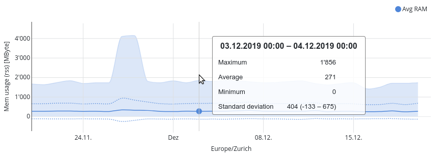
The same data can now be split up like in the following example where the split mode data series was used:
If a large number of graphs appears with the split mode, the page size can be used to reduce the number of graphs per page. The split width sets the per graph width displayed on the pages.
Furthermore it is possible to show aggregated values of all objects within a data serie. The resulting value history shows the average, min and max values and the resulting standard deviation.
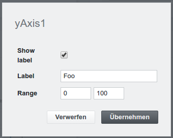
Configure Y axis
Click the Edit y1 to edit the left Y axis or Edit y2 to edit the right Y axis:
| Setting | Description |
|---|---|
| Show label | Show or hide label. |
| Label | Y axis label (optional). If left empty, the label is built from the object's value. |
| Range | Value range on the Y axis (optional). By default, the range is determined from the given values. |
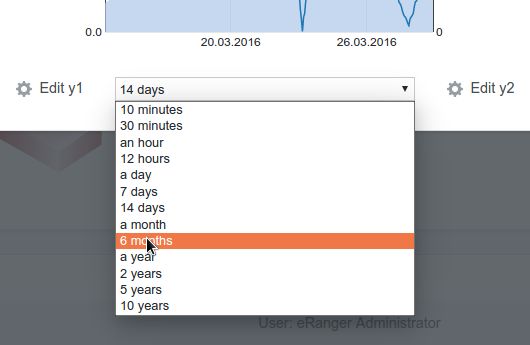
Choose time range on the X axis
Use the select box to set the time range to display.